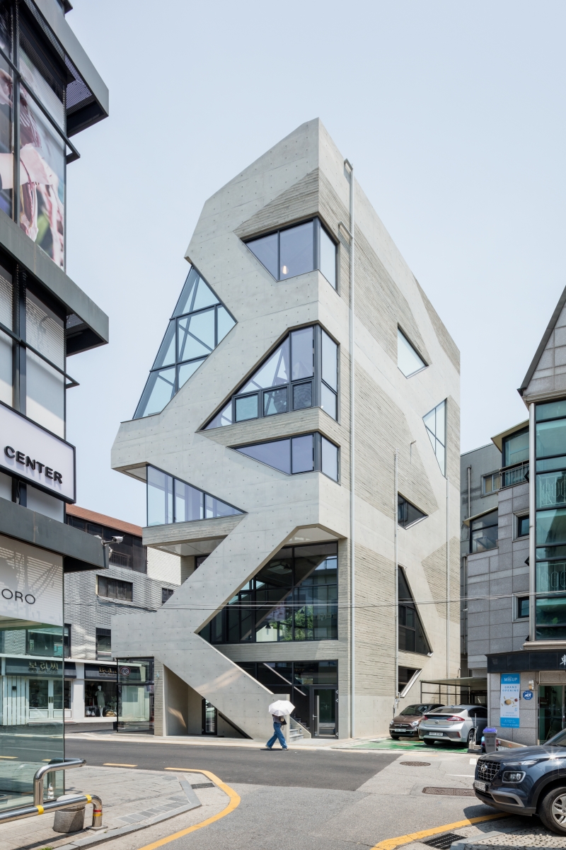
With the notion that ‘architecture is ultimately about establishing order’ in mind, ShinsaBlues is the kind of project that privileges pattern, in the envelope that integrates structure and space, in function and ornament, in circulation and skin, part and whole. Since the arrival of the Gothic Cathedral, which was made of stone capable of withstanding compressive force, ornamentation, circulation, and spatial configuration could be naturally integrated into one overall structural system. On the other hand, modern architecture achieved greater freedom in plans and elevations that separated space, structure, and circulation like the individual parts of a machine, at the expense of a long tradition of building to an integrated form and order. Contemporary architecture has to deal with more information than ever before, such as energy, efficiency, economy, and eco-friendliness, under an extremely divided and industrialised capitalist environment. In addition, as the scope of individuals expands with the development of communication technologies and networks, the relationship between the individual and group has seen an unprecedented shift. Fortunately, as media technology has gradually been integrated into the design process, the present conditions are ripe for an integrated order and form by absorbing and digesting a lot of information through patterns.
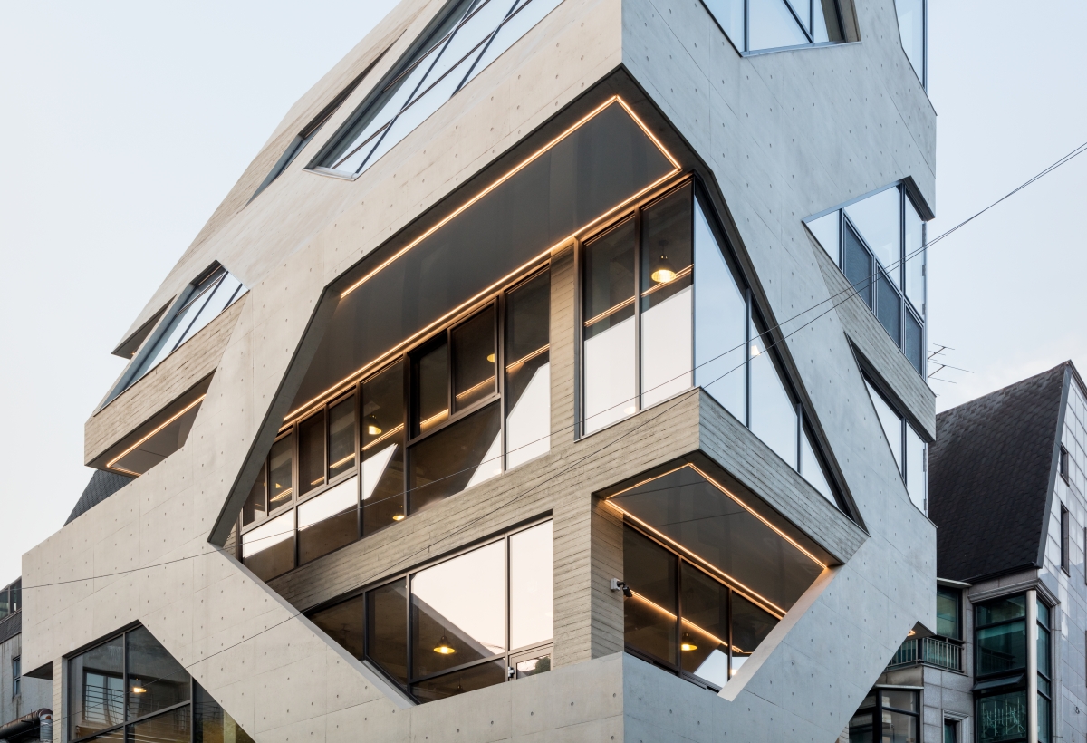
ShinsaBlues is a small neighbourhood living facility located on the so-called ‘Rodeo Road’ near Dosan Park. The street, which was thronged with residents and visitors until the early 2000s, rapidly lost its vitality as Garosu-gil gained popularity. As cafés and restaurants disappeared and clothing stores took their place, the street became darker in the evenings. This vicious cycle of decreasing demand and increasing vacancies while rent remained high was ongoing. The building owners, who were alerted during the decline, made their promotional materials to attract restaurants and voluntarily sacrificed gains (such as lowering the rent) to gradually increase the number of pedestrians on the street. It was interesting to note that people wanted to enjoy and consume a lively atmosphere while also feeling inconvenienced by the high density of the street. ShinsaBlues was designed as a commercial space that would be open to its external environment and location as much as possible by embracing the street that was so lively and dynamic and that it was so difficult for both pedestrians and traffic to move through.
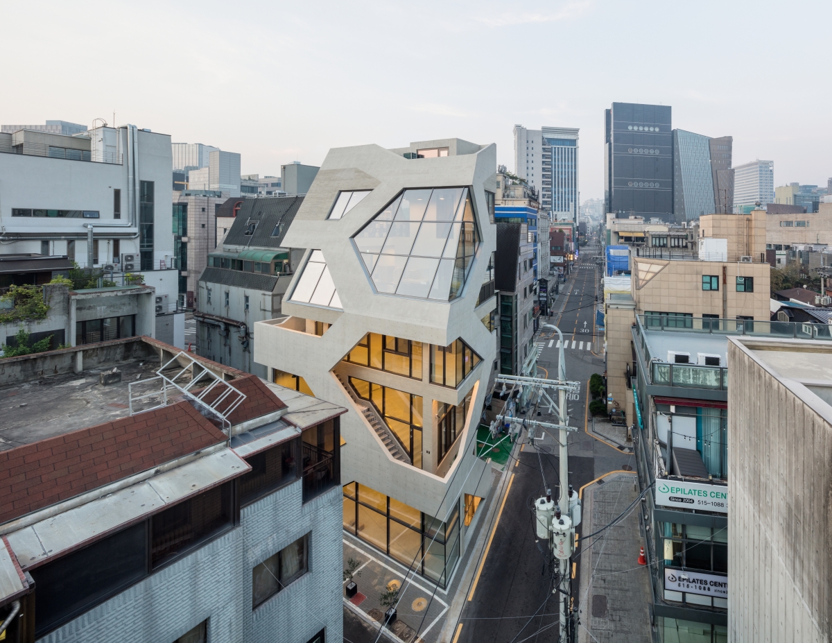
The site is a narrow, less than 60-pyeong (184m2), and was home to a detached house in the early 1970s. The two-lane road turns into a one-way road, located at a bottleneck where the road suddenly narrows. The building is a neighbourhood living facility that requires one staircase and one elevator. Most of the surrounding general shopping malls built in the 1990s emphasise the front and first floors by planning the stairs and elevators as efficiently as possible. This was also intended to shorten the construction period and to maximise rentals, but there was no lively response to the street. Moreover, only the first floor was open to the street and the other floors were not easily accessible. The fact that economically and efficiently built buildings were not commercially competitive also meant that there were many opportunities for design improvements. Above all, general commercial buildings had many architectural flaws. The ‘Two-birds-with-one-stone’ approach had to be employed with respects to both the quantity and quality of the structure. A typical commercial facility in which the first floor is open to the outside and completely blocked off inside from the second floor above was to be avoided, so the circulation system had to be improved. In the sloping architecture of the shantytown (daldongne), the alleys and external staircases mingle around the vertically stacked floors, which has also been attractive. The exterior stairs of multi-family houses, common in the area, were interesting in that they made the road, its architecture, and neighbourhood appear continuous. The way autonomous architecture communicates with the road and leads away to the city prompts a certain dynamism.
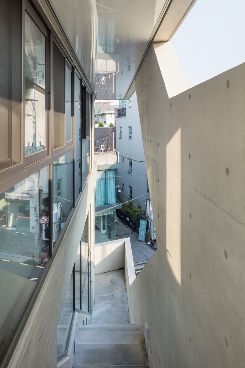
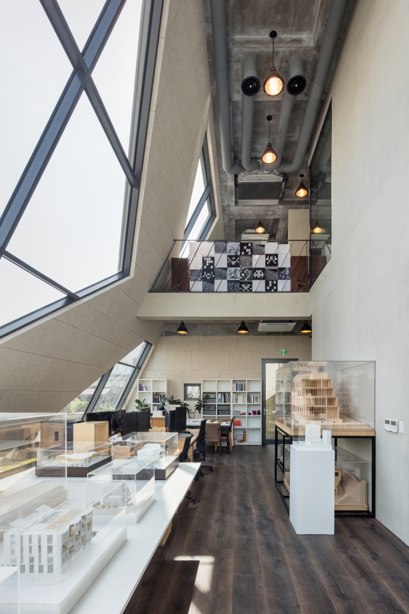
By placing the stairs of ShinsaBlues outside, the architects created a terrace and the effect of drawing the road deep into the interior of the building. It became a solution that could increase accessibility to each floor and increase commercial value. Ultimately, the goal was how best to create an integrated exterior order by absorbing the external staircase that circles the building. First of all, we decided to absorb the railing at least 1.2m-high as part of the exterior wall so that the staircase itself does not stand out as an object. Because a landing space is required for consistent height, railings made of diagonal and horizontal lines were created. By repeating this up, down, left and right, it created a pattern of hexagons. In this way, the stairs are one structure but they are seen as a component of the pattern as if there were several staircases. This created an illusory effect as if the stairs were scattering in all directions like those in M. C. Escherʼs paintings. Each module is composed of a band surrounding it with a central opening. By varying the thickness or size, the size of the window, or the height of the railing, which inevitably depends on the size of the floor, direction, and space, these elements can be absorbed within the same geometric system. It is interesting to note that the entire outer shell has become a field composed of hexagons in a consistent and strict geometric system as if cells gathering to form a living organism by absorbing the Architectural Slant Line Restriction, the roofʼs external railing, and even the indoor railings with a single gesture. The most important feature is that the order derived from the external staircase works structurally; part of the hexagonal module becomes a diagonal column, supporting the upper floor or supporting the roof inside. However, what I enjoyed the most as an architect was the point where part of the pattern was used purely for oranament without any specific role. In particular, the south elevation was at the back of the service space on each floor, so there were not many windows, while the external pattern was maintained and virtual lines were expressed only with a difference in the texture of the exposed concrete. It was not necessarily an essential but a fitting attempt, because it understood that ornament, not decoration, is the most important element in expressing the culture, region, and era in which a work of architecture is located. Eventually, structure and ornament, function and space, and form and atmosphere can all be described as within one coherent system.
The Primitive Hut of Laugier, the first of its kind for human dwellings, was completely integrated with its surroundings. Building a roof that would lean on the trees was at once a space, a window, and a ornament. The reason why we pay attention to indigenous architectures built without the intervention of a modern day architect is probably that it reveals greater possibilities. However, dreaming of architecture without the distinction of structure and ornament, circulation and façade, function and form, does not mean a return to the past. It is simply because we believe that this is a methodology that can simultaneously satisfy quantity and quality, efficiency and space, function and atmosphere in an environment where architecture is swayed by increasingly complex external conditions. (written by Kim Homin / edited by Kim Jeoungeun)
poly.m.ur (Kim Homin)
Lim Hyunju, Lee Jaeman
32, Dosan-daero 49-gil, Gangnam-gu, Seoul, Korea
neighbourhood living facility
184㎡
105㎡
455㎡
B1, 5F
3
20m
58%
199%
RC
exposed concrete (pine board)
water paint on plasterboard
THEKUJO
Jinwon Engineering & Consulting
poly.m.ur
July 2017 ‒ Dec. 2019
Jan. 2020 ‒ May 2021
1.15 million USD
poly.m.ur


