Machine That Perceives Art and City
interview Pierre de Meuron co-principal, Herzog & de Meuron, Martin Knüsel partner, Herzog & de Meuron ЁП SPACE
(* SPACE conducted an additional interview following a press conference held on the 28th of September 2021 at ST International HQ and SONGEUN Art Space. This text draws on the proceedings of the press conference and the subsequent interview.)
SPACE: ST International HQ and SONGEUN Art Space (hereinafter SONGEUN) is the first project realized by Herzog & de Meuron in Korea. Compared to the museums that in some cases have come to represent a city such as Tate Modern, SONGEUN belongs to the smaller scale examples. Is there anything special one must consider when designing small-scale buildings?
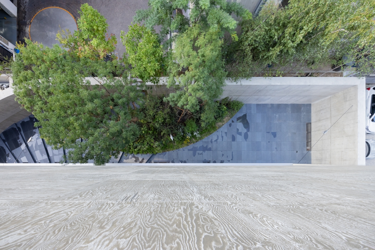
Pierre de Meuron (de Meuron): Small can be not only beautiful but also can have a great energy. The context is also very important in its situation in Seoul, and SONGEUN has a very high concentration and density of energy within a small space. We hope this will be a building that will stand for many generations. In our experience working on museum projects over recent years, many curators and directors like to work with what we call ЁЎfound spacesЁЏ. The Tate Modern is an obvious example, as it was an existing power station with its Turbine Hall. We came to understand that these ЁЎfound spacesЁЏ can be very interesting for exhibiting and perceiving contemporary art. Here, in SONGEUN, our ЁЎfound spaceЁЏ is the ramp. This is not so typical for a gallery, as most are rectangular and closed, and it was developed as something specific for this building. You can walk on top of the ramp up to the second floor, and it creates a circular movement in the garden. Working with these ЁЎfound spacesЁЏ makes experiencing architecture more complex.
Martin Knüsel (Knüsel): Tate Modern with the Turbine Hall becomes almost part of the urban landscape. Although much smaller, SONGEUN also offers a new type of urban space for the neighborhood. One approaches the building through a little garden, which links to the neighborhood behind, and I hope this place will attract people in the future. So the building is not just a building, but despite the limited area on the ground it offers a public space, which also gives access to art. Another consequence of the small footprint was the need to arrange the art spaces on top of each other on 4 different levels. Therefore, it was crucial to think about how to connect those 4 levels in the vertical dimension from the beginning, with the aim to create one coherent experience across the various levels.
SPACE: The triangle volume is the design result of your interpretation of both an urban context and the existing legal issues. How are the form and regulations of the building connected?
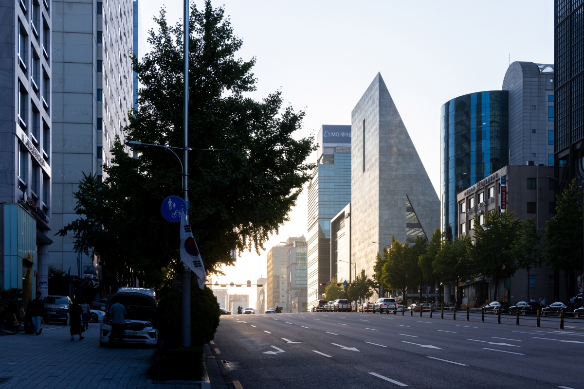
Knüsel: On the small site there were a number of challenging regulations to fulfil. For example, towards the main street we were required to have a 5m-wide public space, a 3m-wide public passage, and a 6m-wide access for cars. The challenge was to arrange these given requirements together in a plan. As if you are playing chess, you have to find the best possible solution; not get lost in the regulations but to create good architecture and spaces. One of the key decisions was to use a car ramp to access the parking. The alternative would have been a car elevator, but we didnЁЏt want to spoil the ground floor with a big elevator and the required queueing area for cars. We then realized that the parking ramp could be used in an architectural way. Now people can walk on the roof of the ramp to reach the second-floor gallery spaces. In that sense we were able to play with the given regulations in a creative way rather than seeing those as obstacles. The triangular building mass represents the maximized volume within the given regulation, with a tall façade towards the main street and a low one towards the neighborhood in the North. From a functional standpoint it was obvious to locate the building core towards the main street, which on the one hand led to a rather closed façade towards South, and at the same time allowed for a maximized generous free space for art and offices towards North. So it was interesting when we realized that we could use the regulative and functional requirements to generate a unique and specific identity of the building.
SPACE: Did the client have any specific requirements?
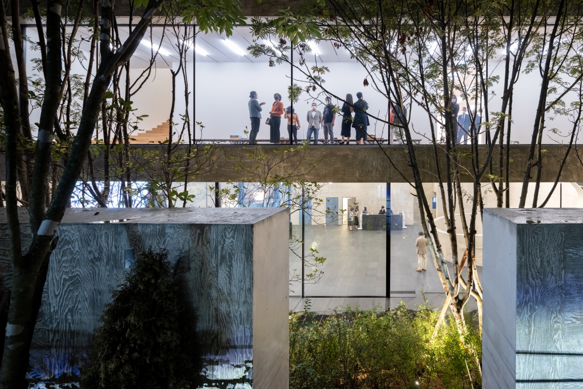
Knüsel: From the beginning it was clear that the client wished for a diversity of art spaces, where one can devise their own experience to view the artwork on display. Connected to this, we sought to create a spatial sequencing that allowed you to discover the diversity of spaces when you walked through the building. A visitor should not know from the beginning what is to come, but instead discover the space gradually. For example, when you start from the lobby, you have a glimpse down to the underground exhibition space, but you walk upstairs following the ramp. When you reach the second floor, you discover a space with a window to the garden, and from there you find a little stair which leads you up to the next floor and with a rather unexpected view towards the neighborhood in the East. So, this process of how you discover art was always a topic of discussion; how can we manage to create diverse spaces under the given conditions?
SPACE: Using larch plywood boards rotated in a 1 ЁП 1m grid, the concrete façade is imprinted with wood grain patterns. Could you tell us more about its effect for the building?
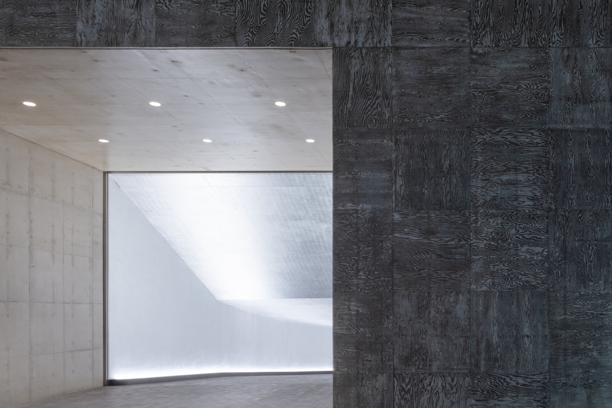
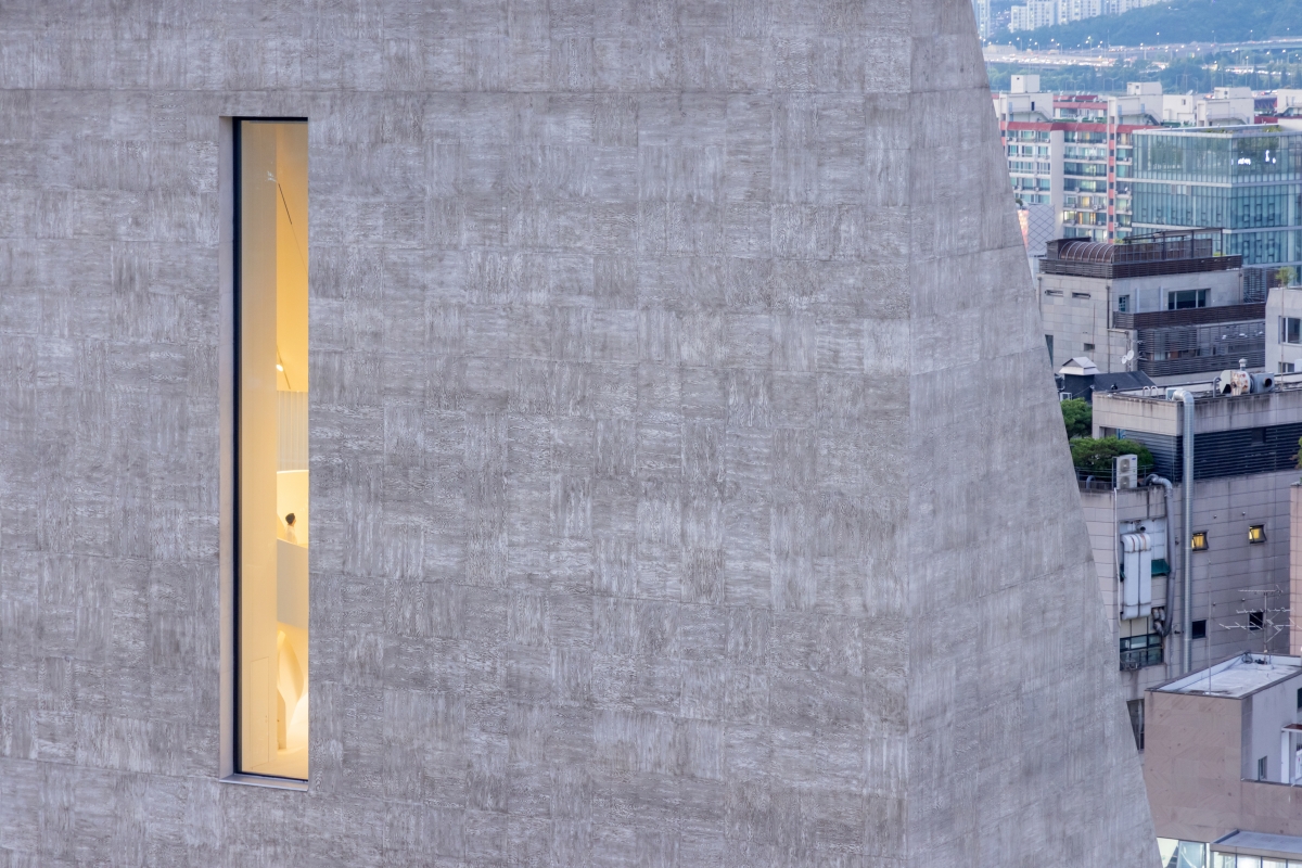
Knüsel: The texture is very important, because it transforms the massive volume, and it gives it another dimension. With the imprinted patterns, every unit has its own unique expression, like a painting, or like a tattoo. Despite being a very solid mass, the building appears lighter, more permeable and takes on a sometimes almost textile appearance. Over time, the wooden texture will become even stronger and therefore the perception of the building may also change with the years to come.
de Meuron: We feel that there will always be two worlds: the digital and the analogue. No matter how the world acts in digital, our senses are maintained in analogue; this is where the haptic quality comes into play. The importance of experiencing the space will all your senses makes it feel real. I think that people can be seen as almost machines of perception, interpreting the world visually, acoustically, and sensuously will forever be a different experience.
SPACE: When I look at your previous projects, such as Prada Aoyama, many of them are ЁЎall-in-oneЁЏ examples of façade-structure-space. Would it be appropriate to consider SONGEUN in terms of this concept?
de Meuron: This is a really good observation, as this was exactly our intention, to bring everything together; function, structure, and the expression of the building all-in-one. We are not as interested in decorative elements, but instead value ornament, as ornament is integrated and part of the expression of the building. I think quality in architecture derives from a holistic approach, when one can take into account all these different dimensions. Here, in SONGEUN, I think we also fulfil that. The form of the building was derived from regulations, and the content is closely matched to functions. We wanted to express a solid piece, like a sculpture, but also something that opens up to the city. Although the two buildings are very different in expression, the similarity between Prada Aoyama and SONGEUN is how they engage with the city, within their context but also in how the city is perceived from inside the building. The interaction with the city is important as the experience is completely different to look at the city from inside the building as it is to look at the city from the street.
Unheimlich in the Capitalist City
written by Chang Yongsoon professor, Hongik University
An apathetic stone-like building has suddenly appeared on a street in Seoul, lined with rows of luxury boutiques. This building is in the image of a quarry, a common and familiar scene before the city was formed. It also takes a primordial form from which a skyscraper was originally conceived, but it still feels very unfamiliar and strange.
The Archaic, Primitive Monolith
Around 2000, Herzog & de Meuron (hereinafter H&dM) materialised their pursuit of a minimal mass and experimentation across a surface in two different ways. First is the method of designing a single monolith, such as Schaulager, Astor Place Hotel, and Prada Aoyama. Second is the method of designing an overall structure in which numerous textile-like interlaced masses are assembled, such as VitraHaus and Actelion Business Center. Between the two, ST International HQ and SONGEUN Art Space (hereinafter SONGEUN) is a building that combines a monolithic mass and an exploration of the surface. Astor Place Hotel is a basalt-like monolith, with which SONGEUN lies on a continuum. Prada Aoyama, another monolith, is a transparent crystalline lens through which structure and space are united as a single entity in contrast to the opaque SONGEUN. However, they are similar in that their surface is intimately related to their structure, in addition to its application as an ornamental feature opposed to a decoration. Since a monolith means a single (mono) stone (lithe), it is related to the culture of the ancient megalith. In Précisions sur un état présent de lЁЏarchitecture (2015), Jacques Lucan calls it ЁЎthe archaicЁЏ, and H&dM describes it as ЁЎanthropologicalЁЏ.
Haptic Surface, Bi-symmetrical Elevation
In SONGEUN, an additional aspect to this mysterious atmosphere is achieved through textural and surface effects. The buildingЁЏs surface, with its texture of a pine-patterned framework, reveals shifts in its appearance determined by the amount of the sunlight.
It is notable when shadows are cast at sunset, the surface no longer resembles concrete. The texture changes as you draw closer to the surface, and this surface is haptic, which indicates the sense of and desire to touch with your eyes, rather than as a tactile property. In contrast to the concrete elevation, the surface of the parking lot is covered with silver leaf veneer, creating the effect of a surface that cannot be felt when it is finished with panels or paint. On the west side of a very classic, symmetrical elevation, there is a futuristic and artificial parking entrance with reflective surfaces and upward lighting. On the east side, there is a pedestrian entrance made of rougher, natural materials. This overall elevation creates a movement that breaks the symmetry.
Innermost Transparency, Floating Rock
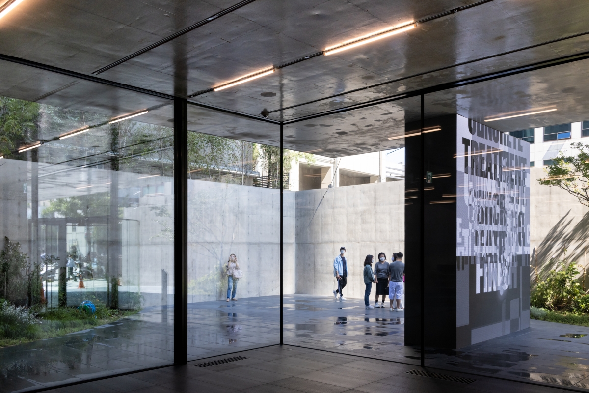
As one approaches the east of the site, one encounters a transparent space on the first floor. The highly elaborate space, in contrast to the opaque and rustic feeling presented by the exterior elevation, presents a fathomlessly transparency and intimacy. The columns have been removed, and just behind the buildingЁЏs exterior wall, there is only a wall wrapped in an electronic display, as if it is not a structural wall. The curved surface of the garden gently pushes us closer to the building, and the cantilever protruding out of the glass surface guides us in a direction so as to enter the building. The structural wall with the electronic display creates dynamic movement directed towards the building entrance. This sophisticated composition reminds us of modern compositions such as the deconstructed box of De Stijl and Barcelona Pavilion by Mies van der Rohe. The transparent space on the first floor makes the buildingЁЏs heavy mass resemble the floating rock in René MagritteЁЏs painting.
Omnipresent Staircase, Two Spirals
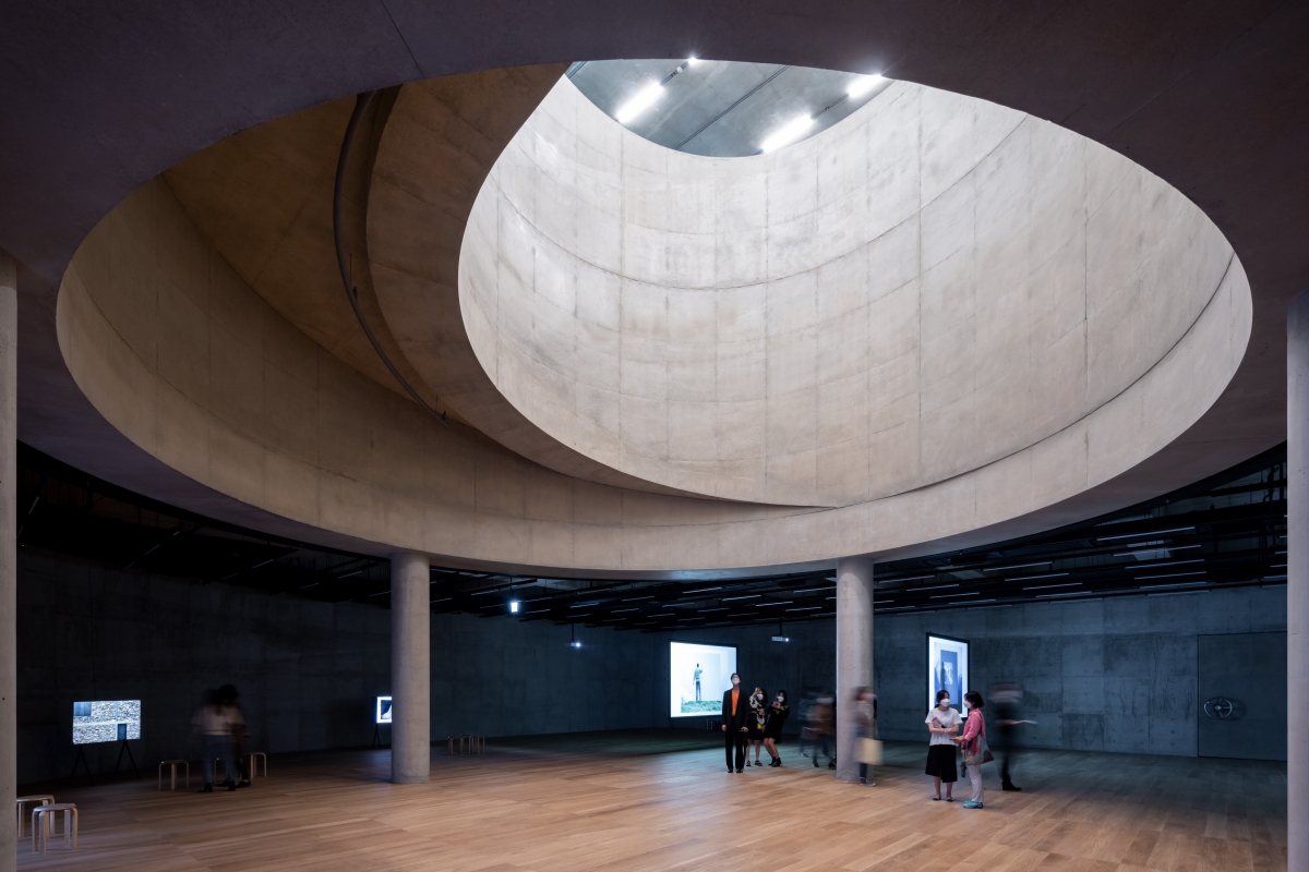
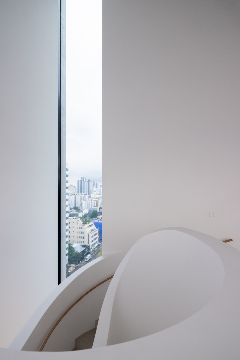
In the lobby, there is a curved railing. The spiral staircase fills this empty space pervasively and widens our line of sight from the inside to the outside. The entwining curves and the floor surface of the spiral staircase spreads out like a fan, and spontaneously guides us to the second floor. The ceiling surface of the cantilever extends over the glass above the spiral staircase and the window frames hidden under the staircase neutralise the boundary between the inside and outside. The difference between the spiral staircase in SONGEUN and those of the previous ones projects is that the staircase here becomes a landscape. While the spiral line of circulation connects the first and second floors, there is another spiralling line: parking area that connects first basement and ground floors. The parking spiral entwines upward clockwise, and the pedestrian spiral connecting the first and second floors entwines counterclockwise. In the case of this building, H&dM takes down the legal limits like a judoka and uses it as a design element. They sublimated the restrictions to send light into a triangular primordial mass, and transformed the minimum turning radius into a spiral composition.
Dialectic of Verticality and Horizontality
In the study models of SONGEUN, there are traces of their experimentation with whether to subdivide the building vertically or horizontally. H&dM decided to interpret verticality and horizontality differently according to the façade. There are only two vertical windows on the south side towards the street. Surrendering views and natural lighting, they created an intentionally understated and silent exterior, while towards the northern city, horizontal windows were placed on each floor to open up the space. SONGEUN is a monolith that is closed on the street side and open on the city side. Verticality and horizontality, open and closed, heaviness and floating, bisymmetry and spiral, stillness and movement, form a contrast in unity. In the penthouse on the tenth floor, where the buildingЁЏs depth narrows, the vertical windows on the south side and the horizontal windows on the north side meet, creating a strong impression of contrast. The spiral staircase placed between them creates a dialectically integrated synergy.
Symptomatic Unfamiliarity
Jacques Lucan aligns the primordial mass of the monolith with a sense of ЁЎsublimityЁЏ. The notion of the ЁЎsublimeЁЏ developed by Edmund Burke and Immanuel Kant is a comprehension of the limit of cognition and experiencing the inadequacy and loss of the subject when encountering extreme magnitude. Sublimity is a distinct sensation in which representation and images disappear, in contrast to beauty. Jean-Francois Lyotard finds sublimity in contemporary art. We experience sublimity when standing in front of the art works. Sublimity rejects a sense of scale and erases the units of measurement. Capitalism made everything measurable. Beauty creates pleasure within a unit of measurement or scale, but sublimity rejects it. H&dMЁЏs SOUNGEUN deliberately removes a sense of scale and erases visibility to escape from being measurable. Sigmund Freud thought of the eerie feeling of unfamiliarity within a familiar environment unheimlich. As a primordial monolith, SONGEUN creates a suggestive unfamiliarity that rejects the measurement systems and scale of capitalism so often found on the high-end shopping street.
Herzog & de Meuron
441, Dosan-daero, Gangnam-gu, Seoul, Korea
neighbourhood living facility
1,179ЇГ
642ЇГ
8,167ЇГ
B5, 11F
59m
Janghak E&C ЁЄ Janghak Design
Oct. 2016 ‒ Aug. 2018
Oct. 2018 ‒ June 2021
SONGEUN Art and Cultural Foundation & ST Internati
Junglim Architecture


