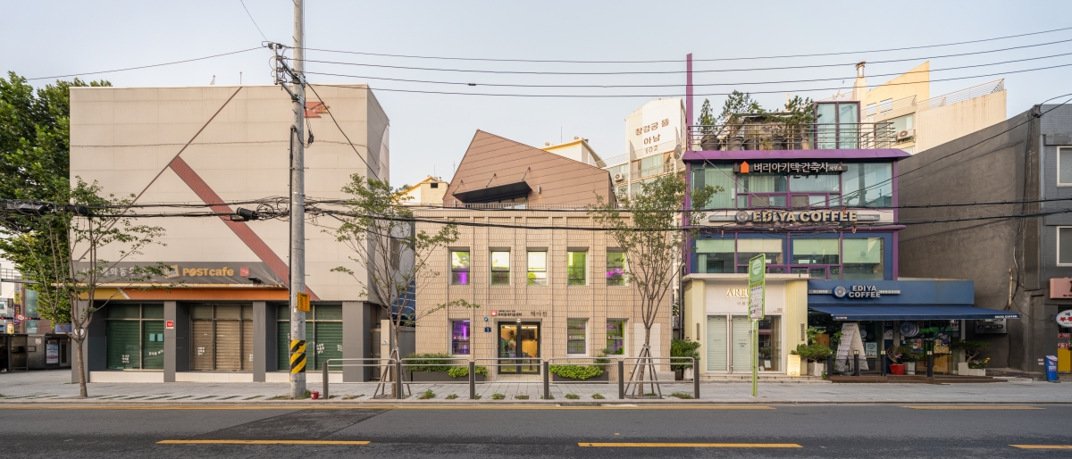
HaeAhJun is a small building located at the entrance of a busy street leading towards Hyehwa-ro from the Hyehwadong Rotary. When we first set eyes on the building, it was so rundown that it wouldn’t have been a surprise if someone had said that it would soon be demolished. Despite the fact that it was owned by the administrative office in a busy downtown street, it had not been used as a public space due to its shabby exterior, used instead as a staff lounge for cleaning personnel, the centre of the Hyehwa-dong reserve forces, and storage. According to situation surveys, it had maintained its existing form after its first final approval for use in 1964, and thereafter, in 2013, the first floor was divided in two using a wall, each with its own entrance, and with the independent central entrance leading directly up to the second floor, so that three different organisations could share the small building. The way that it had been used so carelessly, by boring into its walls, fixing it temporarily up again and blocking it up, resulted in a sorry state of a building which was only in wait to be demolished after completing its life’s purpose.
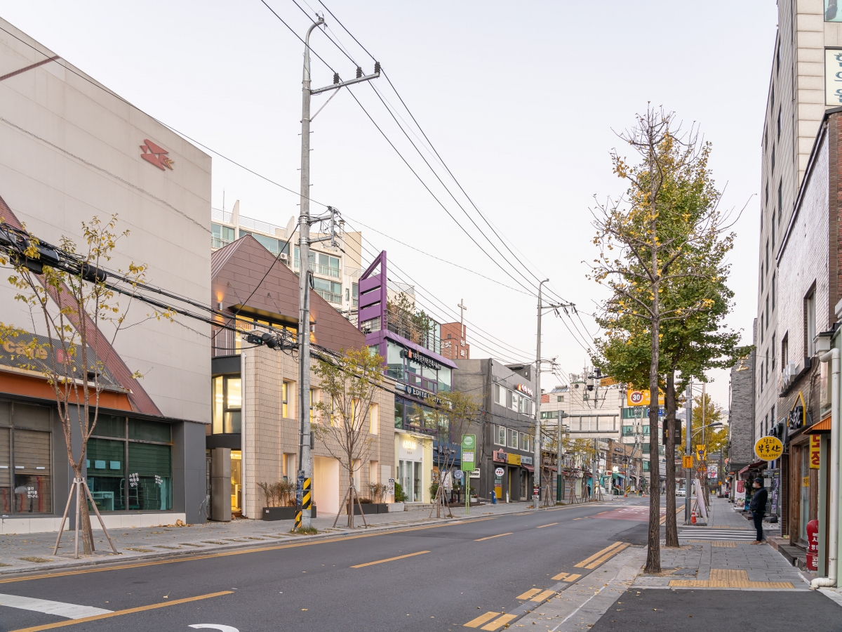
Everybody is attracted to something new. Those implicated in the architectural process tend to be more attracted to the new than the old. The officer of the Jongno-gu Office, who proposed a children’s centre (HaeAhJun), first requested a ‘remodeling project that looks like the new’. However, for some reason, we became interested in the tiles on the building. The tiles, despite being soiled here and there, possessed a clean correlation and order. When analysing the ratio of the windows and main entrance, we could assume that the placement of the entrance was the same as when the project was first built. Other elements concerning how the tiles had been attached in an irregular manner, and that the extreme points of each window jutted out perpendicularly, were introduced to emphasise perpendicularity and orderliness. As it was used in an accessorial manner for a public institution, the outer form had been well maintained apart from an additional outlet on the front façade. The outer tiles, maintaining their original form, came across as more precious and valuable, once we reflected upon how the project would have accompanied the process of transformation in the neighbourhood, including the demolition of the overpass (1971 ‒ 2008) in Hyehwadong Rotary. Perhaps the attraction to these tiles, which transfixed us, was down to the ‘power of old materials marked with the traces of time’.
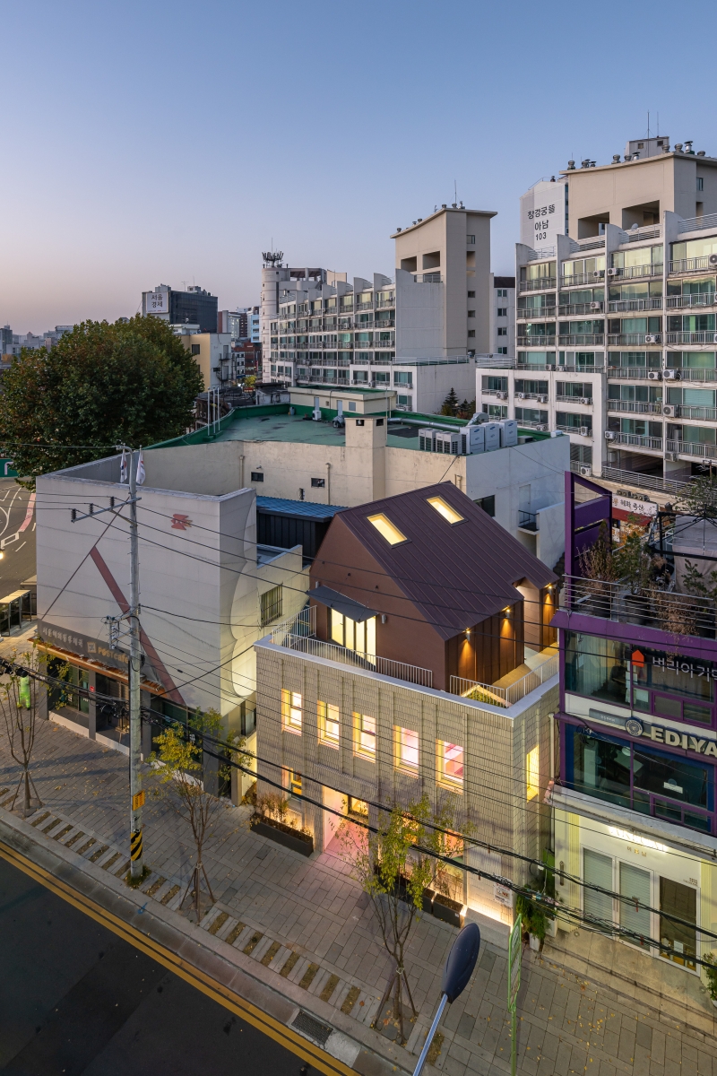
We decided to set the objective of the project as ‘reviving a 56-year-old façade’. We dedicated a lot of time and effort to considering an architectural vocabulary which would respect the existing façade and methods of regenerating it in a more modern manner. All design processes and details were determined in the direction of making the façade stand out to a greater degree. As such, a sense of depth was added to the side of Hyehwadong Rotary, and we set out to separate it from the existing wall structure. The upper extension was turned at an angle and reared so that it would not conflict with the façade. The outlet, which had been added as an afterthought on the project’s front side, was blocked up with new tiles of a similar tone to the existing tiles, and named ‘the wall of recovery’. While we thought it was ok for the tone of the tiles to be slightly different, it was extremely difficult to source outer tiles of a similar size and tone. After rummaging through the internet and material stores, we found a tile of a similar width which was a little longer in height, and we cut these tiles according to the scale of the original tiles to use them in the project.
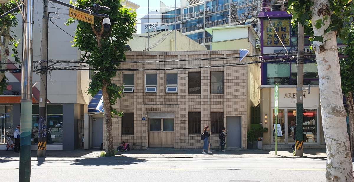
The façade of existing building / Image courtesy of SN Architecture
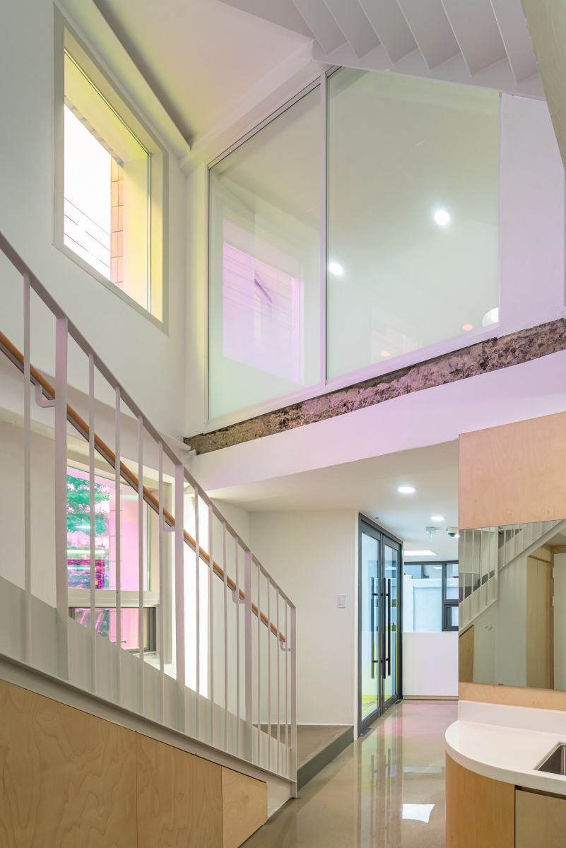
By finishing the side wall with these tiles, we rendered the project into one complete mass. Every time we came across hidden old tiles during extraction, we would excavate even the smallest of pieces and keep them safe, to use on the finishing for ‘the wall of recovery’ and the side wall. We were also very careful when selecting materials for the extension, to highlight the old by using new materials that contrasted with the existing, while, at the same time, hoping that the new would not be too overt. As the project was intended for children, we also contemplated the colours that would be used. While the officials within the municipality proposed that it would be pleasing to have ‘the red, blue, yellow and green’ on the window frames, we were of an opposite opinion. Instead, we applied dichroic film to the light through the windows, to create a façade which could stimulate the curiosity and imaginations of the children.
The existing brick-built building was reinforced with iron core columns and beams as it is a steel frame structure, and three vibration control dampers were installed. As the floors were only 2.7 to 2.8m high, after installing a steel beams of 0.3m, it was no longer an easy feat to secure a ceiling height of 2.3m. It was decided that most of the steel columns and beams would be exposed, and that the direction of the columns would be modified to use them as a framework for indirect lighting. The slabs of the two floors were sliced through to create a staircase, and we intended to preserve this feature as this severed plane was an extremely precious trace. The inner finish was all new, and so it seemed that this trace was the only proof that the building had been fixed up. The third-floor extension had to be a lightweight structure, and therefore it was determined that the timber structure would be more advantageous than an iron core. The third- floor structure was finished with a metal, to differentiate it from the lower floors, and by using wooden materials on the inside it was formulated as a different atmosphere. This place was created as an attic that could be used as a den by children, allowing the children to read on the netted hammock.
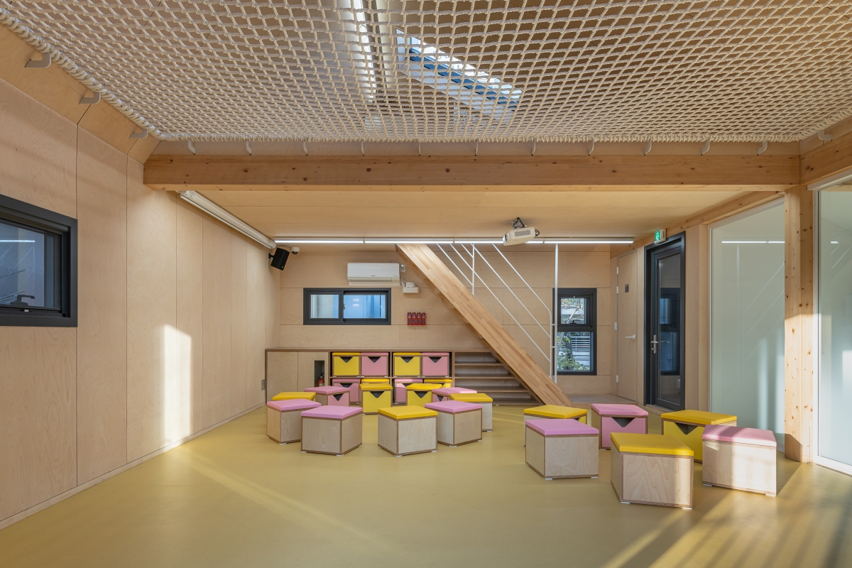
The Jongno-gu Office had planned to create a ‘boulevard specialised for children’ in Hyehwa- ro as one of their publicly pleldged projects. HaeAhJun, which is located at its starting point, was originally planned as a centre to run a range of children’s play programmes and as an information centre for the boulevard specialised for children. However, due to repercussions of the pandemic which came about during construction, the opening was postponed even after completion, causing problems for maintenance. The administrative office eventually came to change the programme to that of the ‘Kiwoom Center’, used to care for elementary school students, and all of this happened after completion, with the managing department and personnel changing, and the architects excluded in this process. The internal spaces were changed to be different from the planned intentions, and for us, who were dedicated to the smallest of projects, could not help but feel a deep disappointment. However, as time passed, we came across the scenes of children enjoying all sorts of fun and laughing in the space on social media. We cannot forget the exhilaration we felt at that moment. We came to think that perhaps the fact that a building changes a little each time according to the user is the destiny of any work of architecture sustained over many years. By breathing new life into an old building which had done all it could, and which was now reborn as a space for children, we hope it can be used for another 50 years. (written by Kim Eunjin, Kim Sangeun / edited by Bang Yukyung)
SN Architecture (Kim Eunjin, Kim Sangeun)
Kim Jinyoung
3, Hyehwa-ro, Jongno-gu, Seoul, Korea
facilities for senior citizens and children
91.6㎡
67.93㎡
before ‒ 135.86㎡ / after ‒ 167.81㎡
before ‒ 2F / after ‒ 3F
10.65m
74.16%
before ‒ 148.31% / after ‒ 183.2%
before ‒ brick / after ‒ steel, timber
tile, zinc, dichroic film
paint on plaster board, birch plywood
Dongyang Structure
Seowon Engineering & Construction
Dongdo Engineering & Construction
Gil-Kwang Construction / Timber structure construc
June ‒ Oct. 2019
Dec. 2019 ‒ July 2020
800 million KRW
Jongno-gu Office
Lab D+H


