Possibilities of Multi‐family House in Pangyo
Due to its location, the Pangyo residential complex is mostly comprised of large families of three or more members with young children. Designing a multi-household residence that will accommodate families consisting of three or more people on a 70-pyeong lot in Pangyo is a challenging task. It is not all smooth sailing to produce a residence of value that abides by the district unit plan guidance and satisfies the demands of the client.
The multi-household residence in Pangyo can be organized into two categories: vertical partitions and horizontal partitions. Typically, a vertical partition has two households with a basement, ground floor, second floor, and an attic. A horizontal partition has one household occupying the basement and first floor, and the other household on the second floor and attic. K&L Residence chose the horizontal partition type but did not add a basement because of the client’s demand to reduce construction costs.
The client had two other demands. One was to secure privacy and the second was to have two bathrooms and three rooms aside from the living (L)-dining (D)-kitchen (K) spaces. It was a dense programme. The demand for privacy limited this south facing plot to not have a big southerly window. Additionally, the securing of parking space for three vehicles was also a limiting factor.
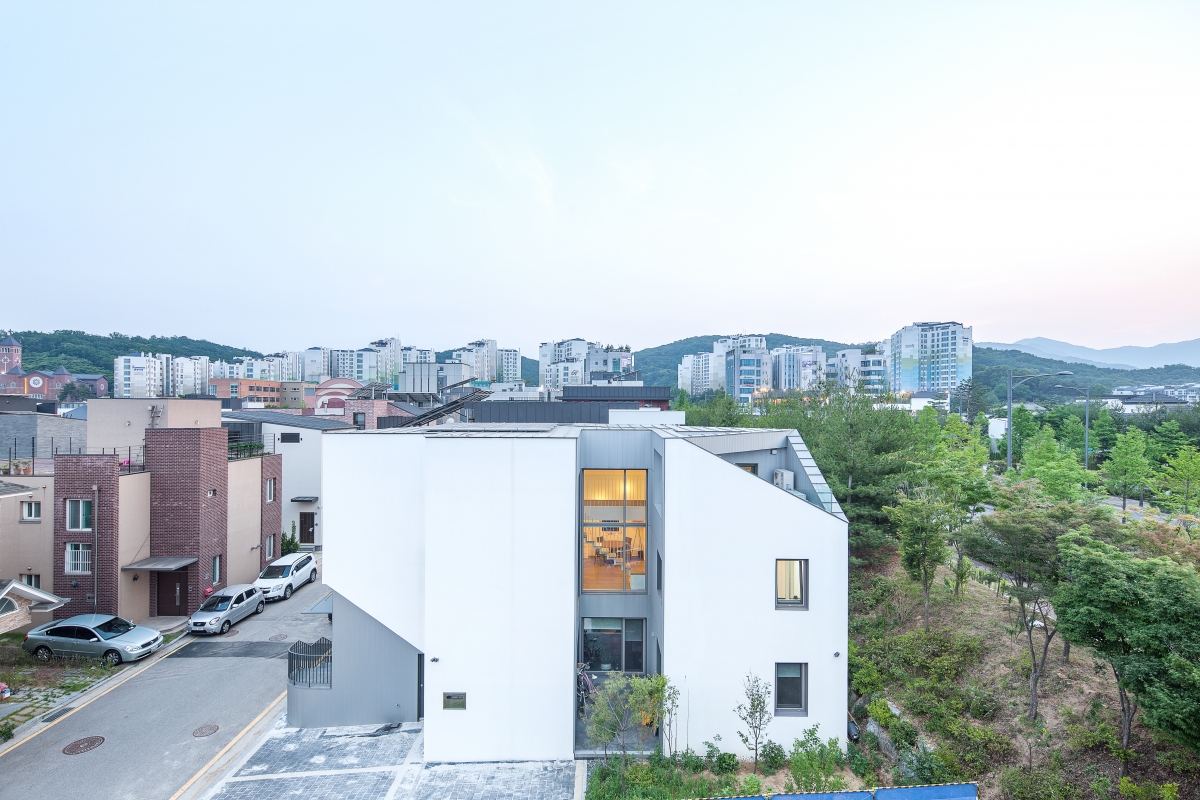
The site conditions were limiting as well. Typically, house plots in Pangyo are influenced by the shape and type of block. The shape of the site was rectangular - not in a square form which is somewhat more appropriate for designing a multi-household residence. And the block plot was laterally situated on the pedestrian street, so that it was disadvantageous compared to a block plot longitudinally situated which is easier to secure privacy while retaining an open garden. In terms of site conditions, the P House, the architect’s first project in Pangyo, was positive contrast to the K&L House.Therefore, to realise the value of K&L House as a multi-household residence, we have to understand the aforementioned site conditions and the demands of the client.
The architect planned an F-shaped plane (rather than an L-shaped plane often seen on square plots) and located the house on the northwest portion of the site. Designing the house in an F-shape was a reasonable solution to secure parking space for three vehicles and three rooms on the first floor. Yet, the architect did not merely settle on the functional solution provided by the plane. The architect proposed a social solution of installing the entrance of 1st and 2nd floors on a common stairway by setting the house back to the North. It is the point that set the house apart from other residences.
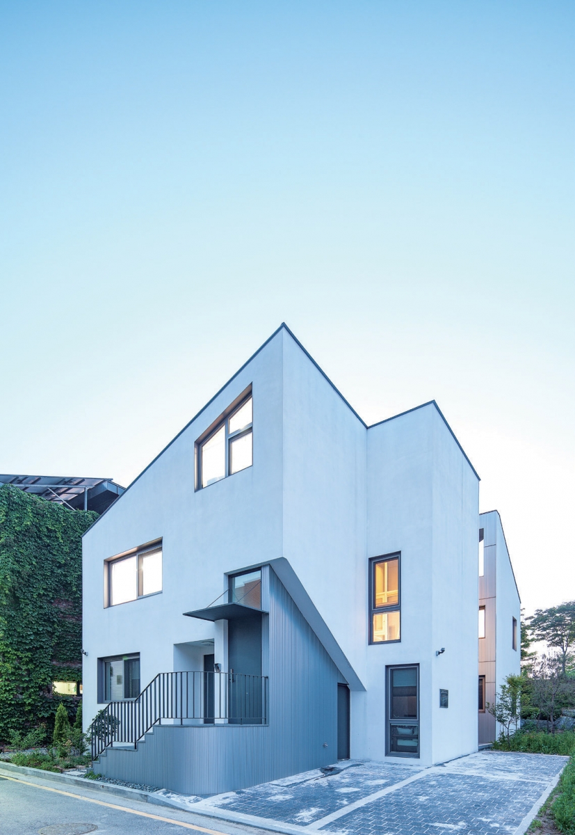
The north portion of the site is more elevated than the south portion. The architect based the ground level of the first floor on the elevation of the north portion. As a result, the first floor slab was elevated from the ground level of the south portion. Four steps up the exterior stairs is the first floor entrance, and four more steps up is the second floor entrance. The exterior stairway became a gathering space for the families of both houses. In addition, the stairway created a deep boundary between common pathway and private building, arguing the significance of the depth in between the common land and private property. This is the first value that K&L House has as a multi-household residence.
The second value of K&L House can be found inside. When looking at the measurements does it become apparent that the widths of the rooms are not large due to an F-shaped plane design. Moreover, the client’s demand for privacy shrunk the size of the southward window in the common space. Through design, the architect was able to liberate the spatial atmosphere that could have been somewhat constricting. The width problem was addressed by height and depth direction, which enabled the architect to create an ‘inward expanding house’ rather than an ‘outward expanding house’.
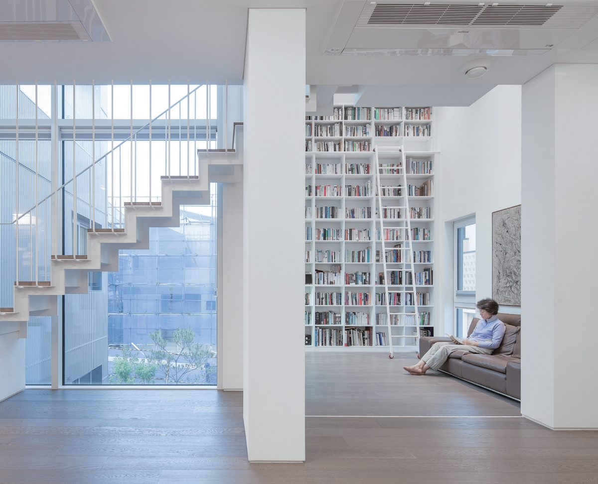
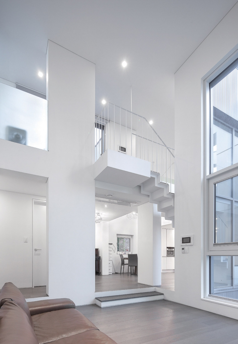
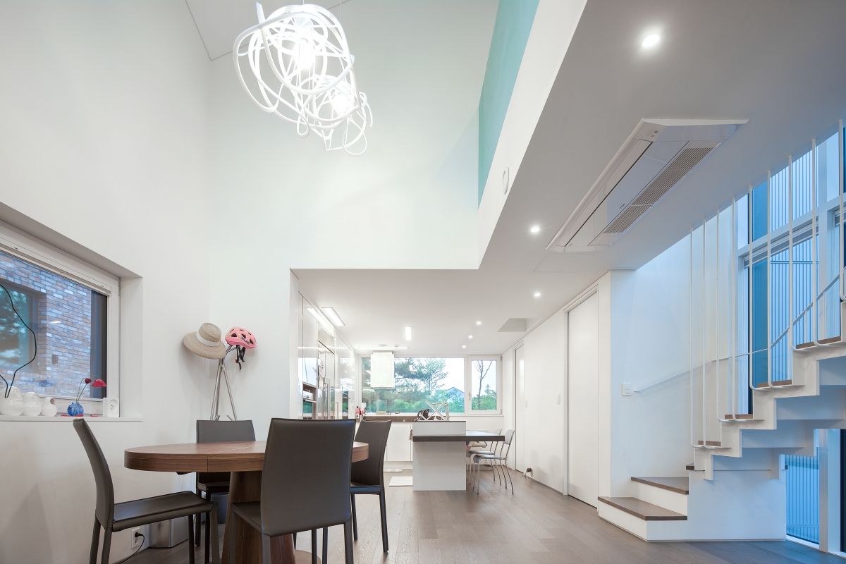
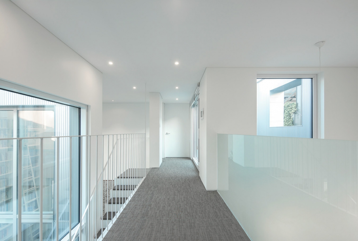
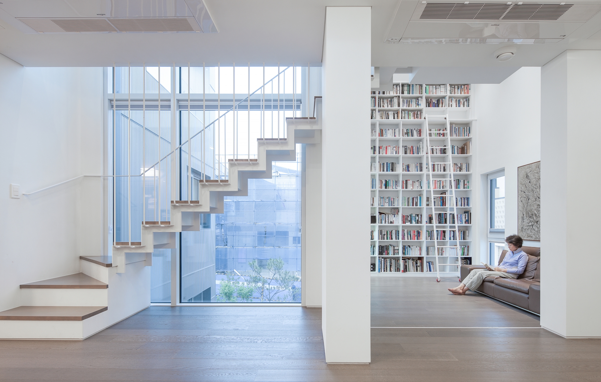
The landlord’s house on the 2nd floor is expanded from the living and dining’s height and the dining and kitchen’s depth. A sense of elevation was added with an enormous bookshelf installed in the L space and a window on the flank to allow for the penetration of indirect light. On the north side of the K space, a front window was installed above the sink to view houses beyond Pangyo, and it carries a sense of depth. The climax space of the K&L House is not the L space, but rather the D space which links L-K and has intertwining senses of elevation and depth.
The D space made me evoke what John Ruskin said in The Seven Lamps of Architecture: ‘The memories of buildings, perhaps, in their first address to our minds, of no inferior pretension, but owing their impressiveness to characters of less enduring nobility – to value of material, accumulation of ornament, or ingenuity of mechanical construction. […] While, therefore, it is not to be supposed that mere size will ennoble a mean design, yet every increase of magnitude will bestow upon it a certain degree of nobleness.’
Judging by the use of white stucco and aluminum valley board panels on the exterior, the K&L House did not elect to use expensive materials nor lavish ornaments in the finishing. As heightening the house costs more, the height or depth of the indoor space could not be extended infinitely. However, traces of the architect’s endeavour to increase the size of even an inch within in the given conditions can be found in the L-D-K spaces and rooms of K&L House.
On the roof-top there are two sky gardens, two voids, and two attics. From the roof-top, one can see why this house is persistently expanding, and in the attic, one can comprehend the reason for the roof-scape set upon three sloped surfaces. The attic’s sloped roof resulted from an aim to satisfy the weighted average of the attic and to secure just an inch for a higher ceiling.
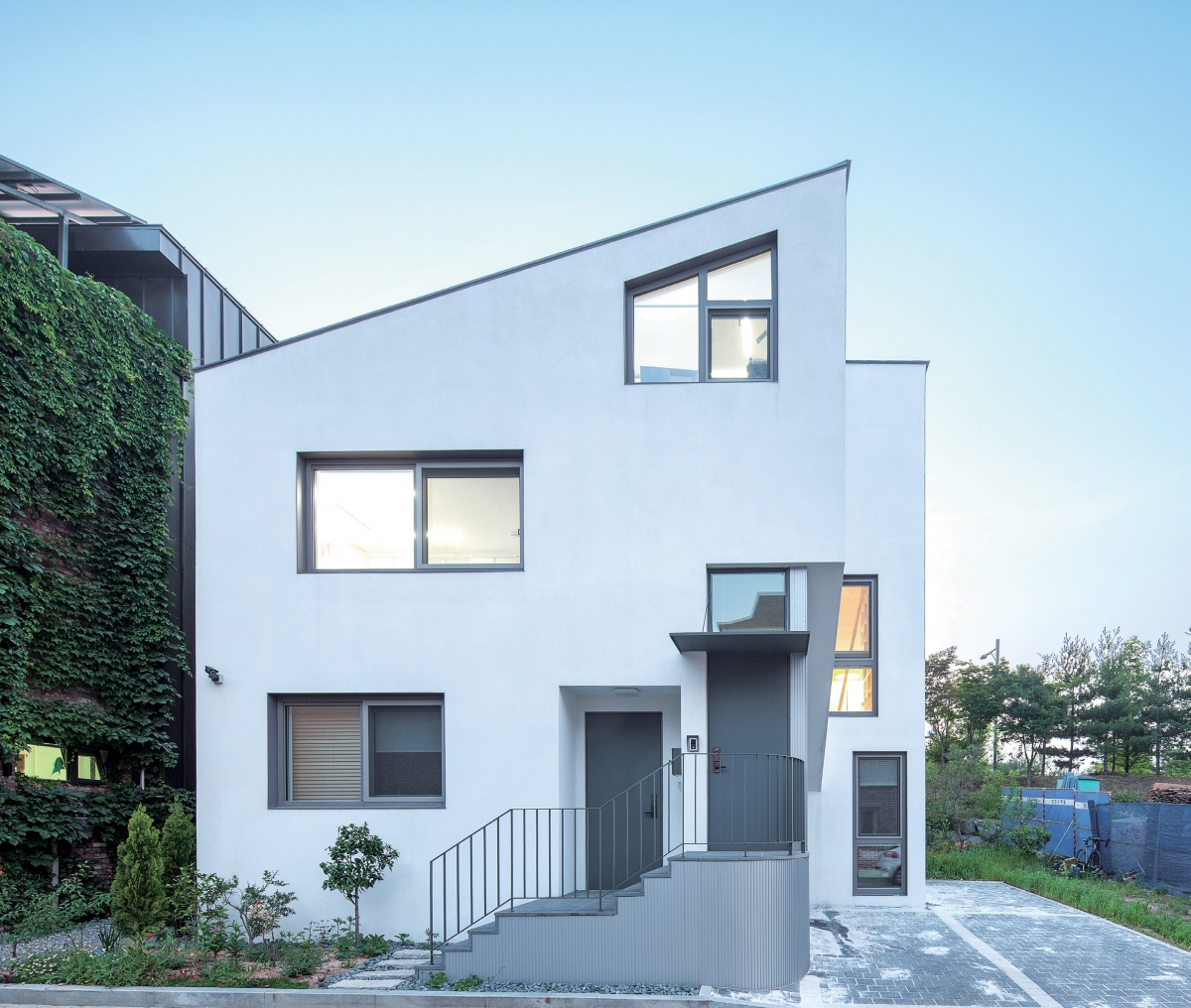
The architects of the K&L House carried out their thought process within the given conditions. Although the given conditions were limiting, the architects managed to present a new experiment to the multi-household residence scene of Pangyo. The K&L House set forth a social argument, with the depth of the outside space at the front and a shared outdoors stairway and multi-household residence that could overcome the limitations to width, height and depth, by building an inwardly expanding house rather than an outwardly expanding house. This by itself presents the unique value of K&L House Pangyo.
Kim Taeyoung (Korea National University of Arts) +
Pangyo-dong, Bundang-gu, Seongnam-si, Gyeonggi-do
230.6m2
115.18m2
184.4m2
2F
3
8.98m
49.95%
79.96%
reinforced concrete
exterior insulation system, aluminium panel
vinyl paint on gypsum board, wood flooring
Architecture Structural Research Institute DAWOO
Hanil Mech. Elec. Consultants
Sungji ENC
J Archiv
Oct. 2015 — Feb. 2016
May 2016 — Feb. 2017
Ongodang Architects
Kim Taeyoung and Kim Hyunjun are advisors of Urban Topology, a design cooperative group, working in art, architectural urban projects with the interests in the topological approaches. The design work includes co-housing (E community, P village 2017), Cultural Space (Jeongseon Indigenous food studio 2018) and space regeneration projects (Seongdong-gu Open library 2018, Jeongseon culture space 2015).


