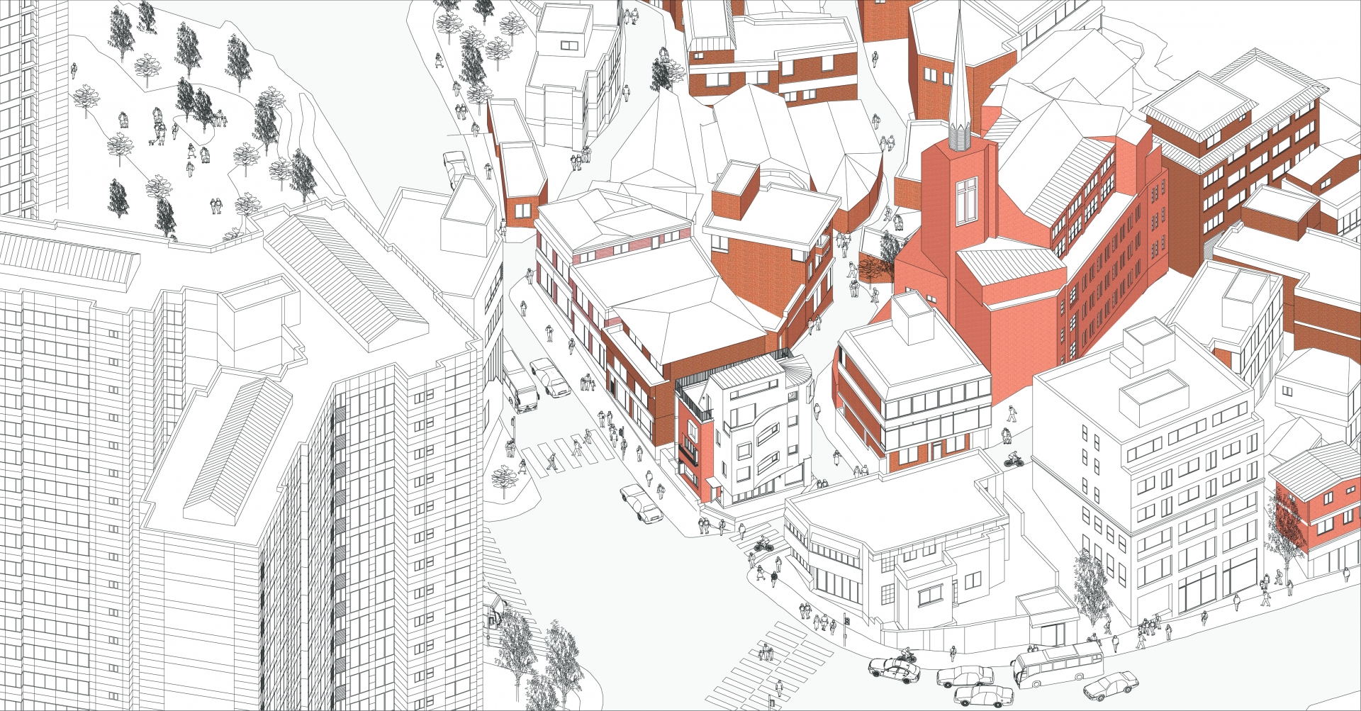
There are three groups of stakeholders in the neighbourhood living facilities in Korea: landlord / tenant or shopkeeper / end-consumer or Instagrammer
Which among them should be targeted in the planning of neighbourhood living facilities in contemporary Seoul? IЁЏm pretty sure that the focus should be on the idea, requirements, and the dreams of tenants or shopkeepers. This is because communication with end-consumers can be measured by the attractiveness of the brand and the management of tenants. Therefore, the planning of the facilities should continue to listen to what the shopkeepers prefer, and these days they tend to expect quite similar features in spaces.
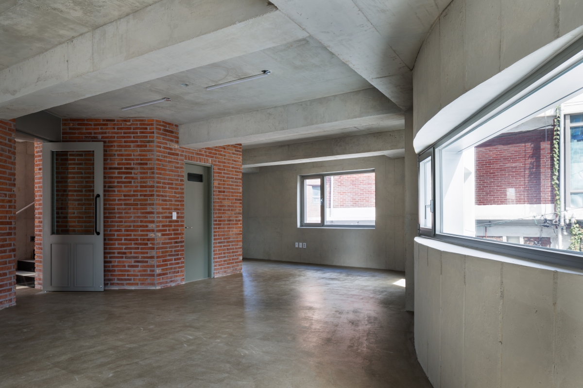
The composition of todayЁЏs neighbourhood living facilities is to provide a variety of choice in design, as rent varies floor to floor; for example, openness to the road on the first floor, a separate entrance and its location leading to the basement, sunlight, balcony, and attractive staircases for the second and third floor, and a high ceiling height and pitched roof for the uppermost floor.
Cuteness
Not only neighbourhood living facilities but also shopping malls have shown a tendency to shrink standard store modules from 130m2 to 50m2 and even to 16.5m2. The trend for so-called micro-development shown in the economic and social shift to miniaturization and personalization is also reflected in the space. When I interviewed storekeepers about the identity of their small stores, the most frequent expression is ЁЎcuteЁЏ. Although there are many refined coffee shops, most would-be operators of small stores prefer the expression ЁЎcuteЁЏ. A pretty shop in a charming building may sound too popular an expression, but I think that we must listen to them. You may better understand it if you read their intention to open their shops after fixing a retro building. A building of strictly controlled design and proportions would be agreeable, but sometimes intentionally irregular windows and popular appearances work better for small stores when they are completed with signage on the façade. As a commercial environment planner, I venture to suggest that ЁЎthe beauty of a neighbourhood living facilityЁЏ can work when it is equipped with a layout suitable for shopkeepers and a charm that is unique to a small store.
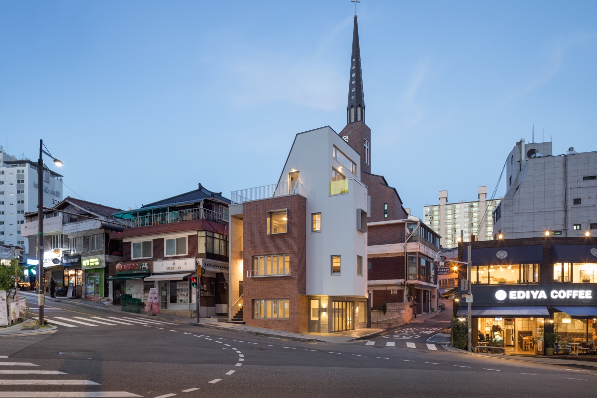
Geumhodong Re:trace
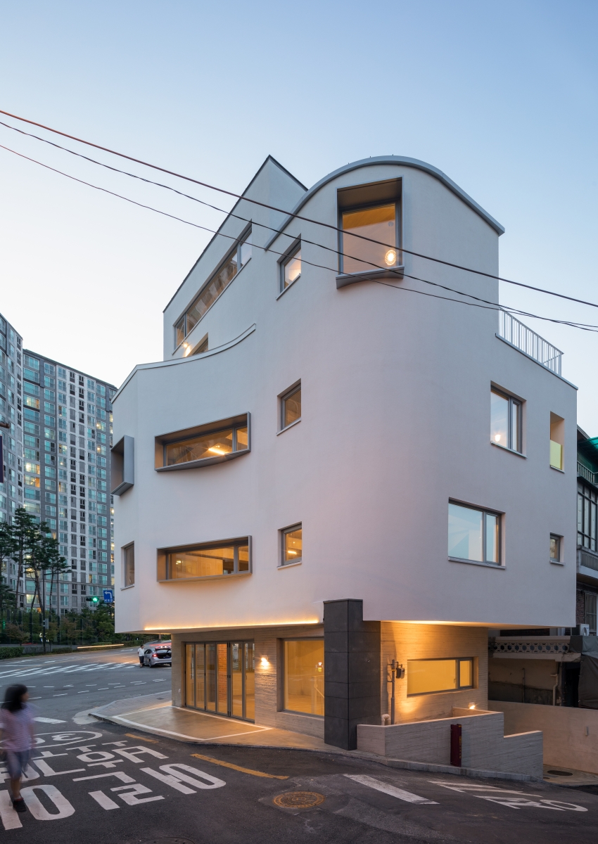
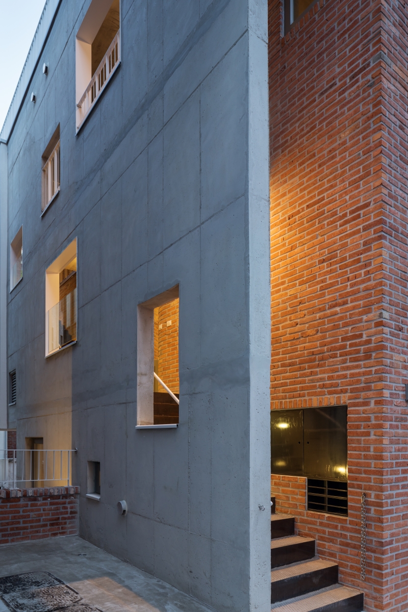
This building in Geumho-dong can be regarded as an example of quite an exact solution in terms of its design and appealing qualities, considering its location and market power. The entrance to each store is as follows: a ground-level store with an approach from the main road, semi-basement store with an approach from the side street, second and third level store with a straight staircase, and a store on the top floor. Compared to a single staircase layout, this can give different experience when entering each store and leave room for a variety of brand signage and entrances. The first floor and basement are expected to be preferred by trendy food and beverage shops such as coffee shops, pubs, and modern Korean restaurants, but the indoor stairway connecting the first floor to the basement floor with the intention of combining two floors may discourage flexibility by renting small store spaces and this will also reduce available space on the first floor. On the second floor, thanks to recent low rents, daily neighbourhood living facilities such as F&B or flower shops designed with strong concepts in mind are leading small classes in the neighbourhood unit, and the third floor has separate porch spaces and the fourth floor has large terraces, devising an eye-catching composition in the studio and editing shop which occupies two floors.
An example of careful consideration can be found in the design of the toilets. The idea pf the location and the management area of the toilets is quite an important factor in the planning of neighbourhood facilities made of several stores. The strong point in favour of placing toilets in the public space is that they can be shared on each floor, and menЁЏs and womenЁЏs can be separated on different floors, but they can be also vulnerable in terms of safety and management. Geumhodong Re:trace seems to emphasise the safety of toilets by planning toilets managed by each store.
On a larger scale, I expect to see many changes to the approximately 50 small parcels, including this building, in the future. Small parcels of a proper size, surrounded by a large apartment complex, seem to have sufficient commercial potential.
I hope that the building will have a more positive influence on the surrounding small units. I would like to make a closing comment about the exterior material. A single material would have been better for the exterior rather than the combination of two materials. The brick and exterior insulation system of the building already contains enough variations in their formal gestures, and the irregular windows and balconies. Considering the signage that expresses each storeЁЏs identity, making each buildingЁЏs exterior into a single background will create a tidier universal image in the end. It would have been better to have proceeded with this, as it could be recognised as a small and appealing building from the apartment complex, which is the biggest potential customer.
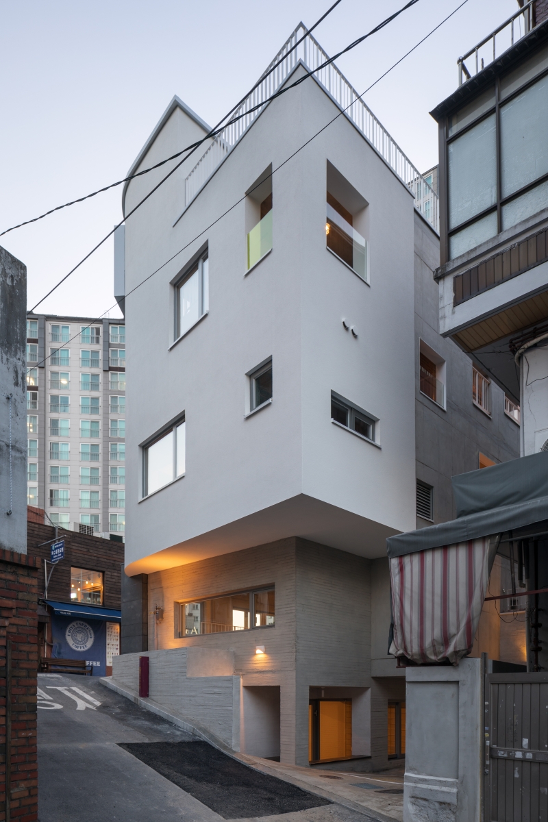
There is a semi-basement floor with an approach from the side street. I expect it to be preferred by trendy cute shops.
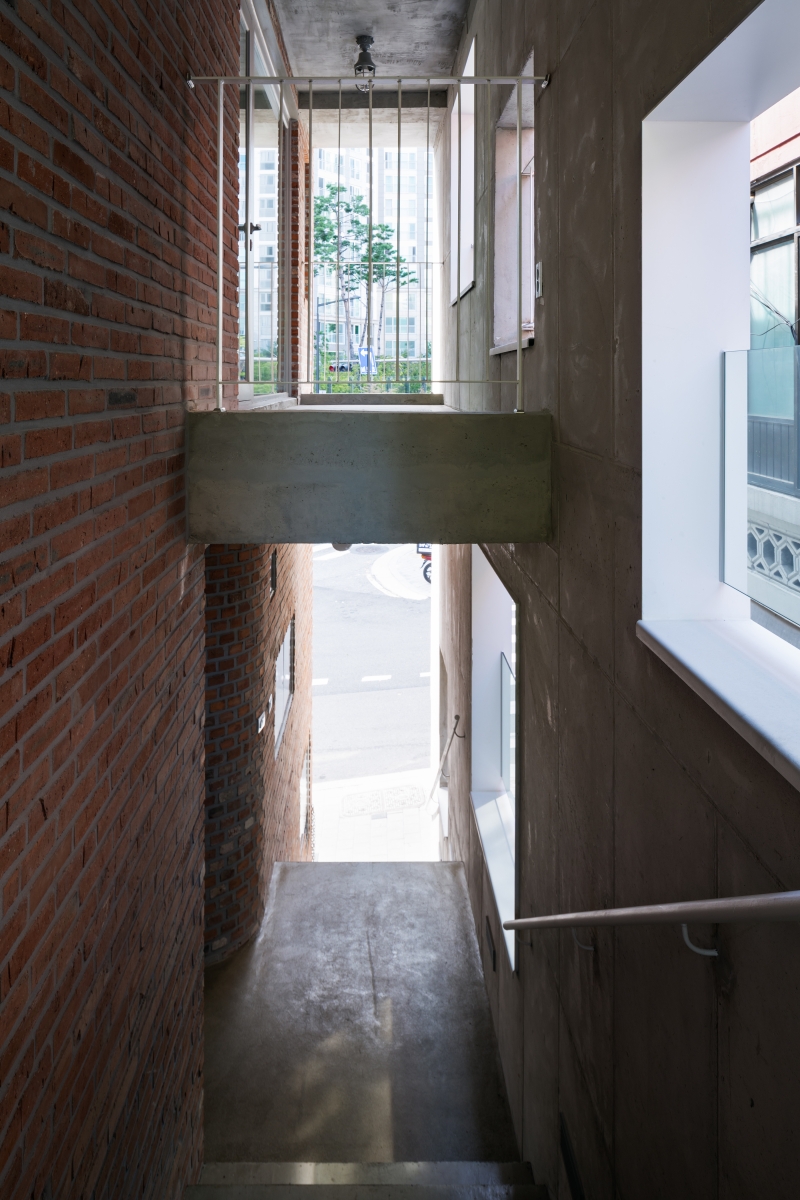
Planned to be managed by each store, customers enter the second and third floor with a straight staircase.
Architect
Studio Morph (Park Jongmin)
Location
Maebong-gil 16, Seongdong-gu, Seoul, Korea
Programme
commercial facilities
Site area
126m2
Building area
75.29m2
Gross floor area
323.89m2
Building scope
B1, 4F
Parking
2
Height
13.51m
Building to land ratio
59.75%
Floor area ratio
196.54%
Structure
reinforced concrete
Exterior finishing
red brick, stucco
Interior finishing
exposed concrete, brick, wetlook coating
Structural engineer
Eun Structural Engineers
Mechanical engineer
PCM Global Engineering
Electrical engineer
Kunchang Engineering
Construction
TCM Global
Design period
Mar. – Aug. 2016
Construction period
Mar. – Aug. 2017
Client
Shim Whaseon
Park Jongmin
Park Jongmin received his Bachelor of Science in Architecture from Sungkyunkwan University and worked at LOTTE E&C. At Yang Jinsuk architecture office, he worked as a senior designer in various projects. He currently opened his own practice Studio Morph, and has been doing architectural design and photography. His main works include Yeoksam-dong Sector design building, Seocho-dong st1566, SongGokChunGa Jeongeup House, Munhori house, and Wandukong share house.
Lee Ho
Lee Ho is the founder and principal of Fit Place. His main interests lie in property development projects and UX design, and he has been creating spaces close to peopleЁЏs daily lives such as hotels, F&B, retails, among many others. He was the former director of Design Core and Strategic Planning Division of Kunwon & Partners, and the leader of SOUNDS Company, a cooperative venture for JOH & Company. His practice Fit PlaceЁЏs major works are Hapjeong-dong FOURBASIC, Healthclub at Heyground and Seongsu-dong Safehouse. He is currently working on the IKEA Gangdong storeЁЏs planning and design.
89


