FROM VEHICLES TO PEOPLE, FROM PEOPLE TO CITIZENS
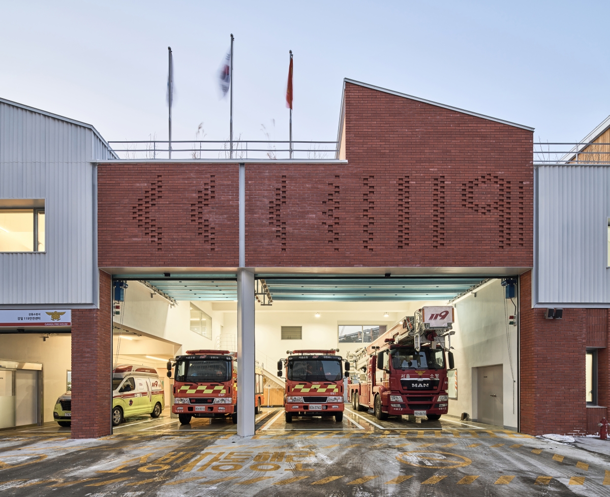
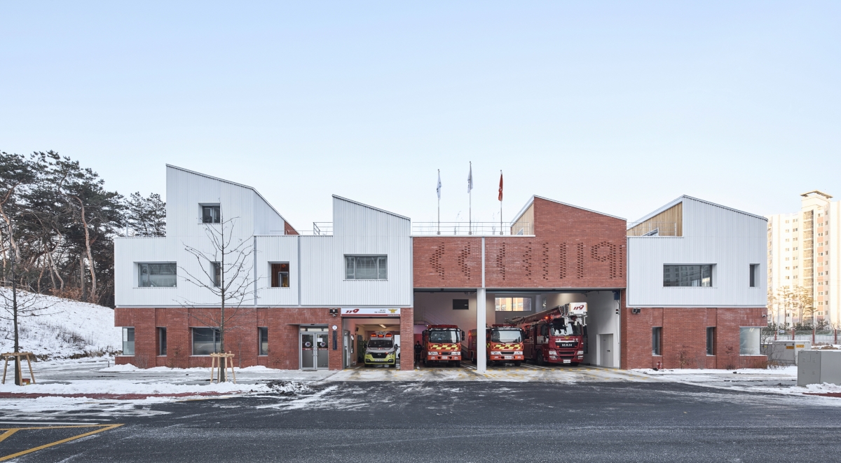
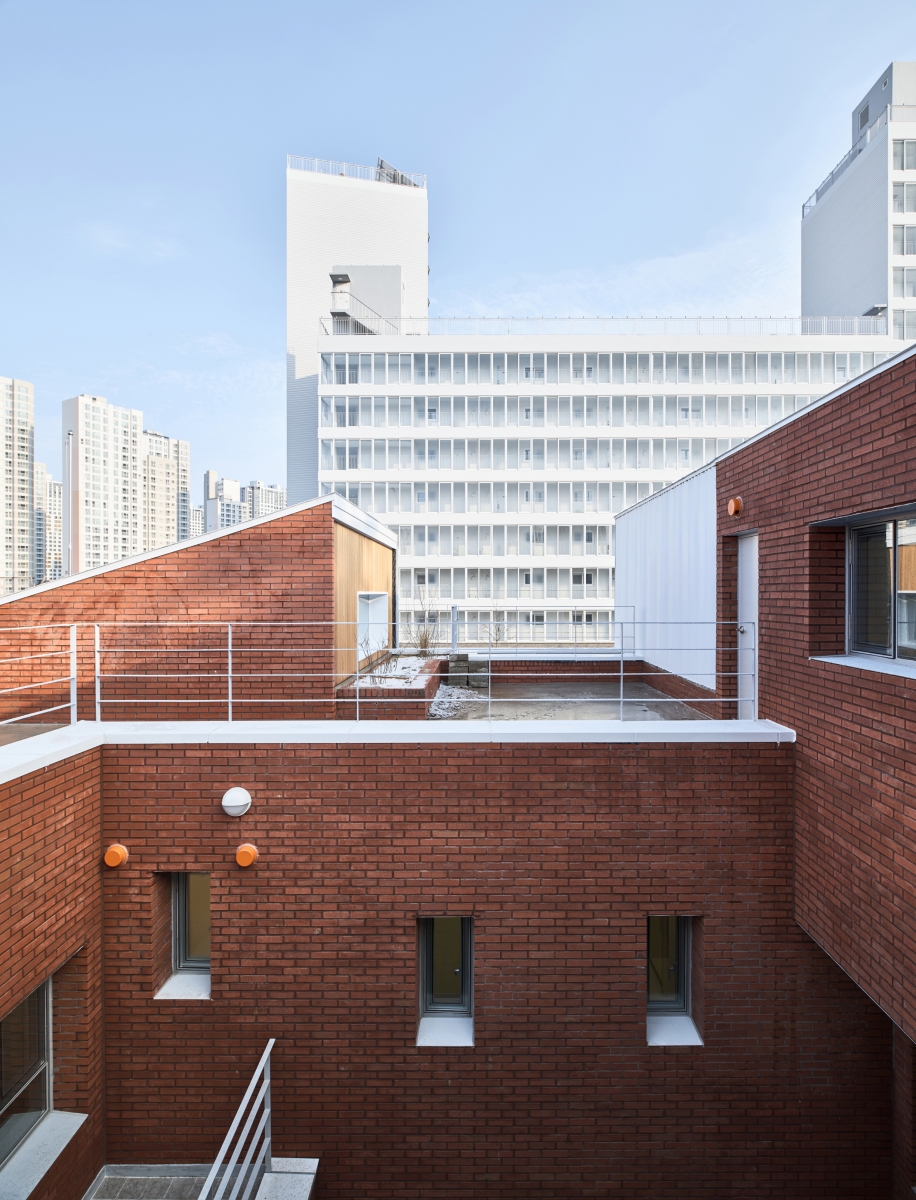
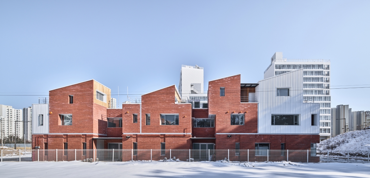
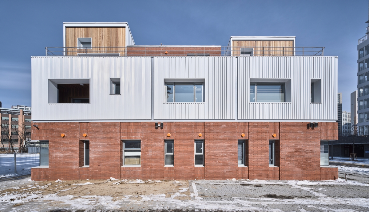
The Gangil 119 Fire Station, located at the eastern tip of Seoul, is on a site that is part of a new residential development area within newly constructed apartment housing estates. It contrasts with the surrounding flat, elevated apartment blocks, as it is composed of an assemblage of small white sloping masses carefully placed on a red brick stylobate.
Familiar Fire Trucks vs. Unfamiliar Fire Stations
The fire truck has the vital purpose of saving lives. In its other guise, as a popular children’s toy, it can be found in almost every home. Perhaps this is why the fire truck is thought of as familiar and friendly. That said, how do we feel about fire stations? While it is not advisable to generalise, the fire station can feel a little unfamiliar compared to the fire truck. Perhaps this is largely due to the symbolic image of the building? Unlike other buildings, we recognise the presence of a fire station simply through the large and wide parking area facing the road, the fire trucks which at times are seen through the open parking gates, and the front of the station which serves as an entrance and exit for large vehicles. Most fire stations around us are painted in red with a 119 signpost dominating the façade of the building, announcing to all in a loud cry that it is a fire station. The fire station is a public institution created from an inevitable public need, like community service centres and security centres, assigned according to administrative boundaries. Shouldn’t it exist in a more agreeable manner between the locals and the city, as a public building?
Vehicle-Centred vs. People-Centred
The fire station has several conditions that mean it must inevitably be defined by a typical form. First, a space to keep the fire trucks. Planning for parking spaces of sufficient space is necessary to accommodate the many fire trucks. All of the vehicles in the parking spaces must be capable off exiting without impeding the passage of other cars and must allow room for frequent maintenance and repair. The second is a circulation system which prioritises emergency calls and the principle of catching the ‘golden hour’. To such ends, the office in the waiting room must be directly connected to the central parking space. While this may seem unrelated, this second point is similar to the first, as its need originates from those of the parking spaces and vehicles. The architect, Nam Jungmin began the project by composing spaces for the firefighters as a key aspect of the plan while satisfying the basic conditions regarding fire trucks and parking spaces. The prerequisites of the high and large parking spaces and the firefighting facilities occupy 50% of the building’s volume, yet upon calculation, only 30% of the floor area, with the remaining 60% dedicated to spaces for the daily lives of firefighters, such as office spaces (office and public complaint office) and living spaces (waiting rooms, cafeteria, and resting area).
A Part vs. The Whole
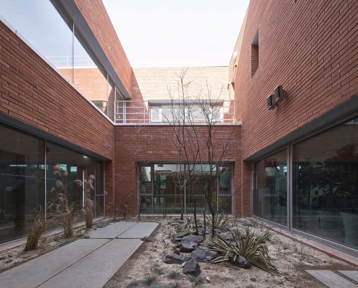
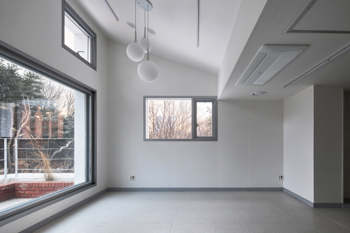
An interpretation of the more user-oriented design of the Gangil 119 Fire Station begins with an assemblage of spaces such as the waiting room and the rest area. Each of these spaces had to be arranged to face the outdoors and the natural surroundings to provide comfortable environments for the firefighters who are on stand by over long shifts in the fire station. The courtyard – intended to be a pleasant space – is located on the first floor and rises vertically, connecting the entire space and serving as a bridge between the office and rest spaces, office and parking spaces, rest and training spaces. It is also more than simply a physical space of connection, as the courtyard uniformly connects and absorbs tensions between the tall and large volumes of the garage with the smaller individual residing spaces, all within the composition of a single building. Each of the spaces arranged from the first to third floor serve as living spaces for the firefighters, each planned as independent volumes like small houses, and these small units exist in alignment with the whole, as a single module that visually moderates the entire building. This interaction between part and whole, from whole to part, can be acknowledged in both the inside and outside. In particular, the concept of the sloping roofs, found in the private spaces for the firefighters, was also applied to the fire truck parking area, allowing light to enter and to transform the space. The design signals a distinctive departure from existing parking-centered fire stations. The redbrick used on the lower floors and the second floor space finished with a white metallic material, as well as the shadow effect created by a band that clearly differentiates the two, completes the entire narrative. The architect aimed to overcome material constraints and to extend the space in order to rework the small demarcated space into a pleasant (user-oriented) environment for firefighters. Here, the architect elected many methods. First, each of the rest areas were designated as high vertical spaces and elevated windows thanks to the volume of the sloping roofs. Through this, it was possible to secure natural light and ventilation, but also to establish an order in the outside spaces. Second, the courtyard mentioned earlier: through the courtyard, almost all of the individual spaces are given the opportunity to come into contact with the outside area. Simultaneously, the courtyard aligns with and carefully arranges each of the small spaces as an intersection between emergency-call circulation, settled spaces, waiting areas and parking spaces. Third, the assortment of differently sized windows placed at the fore of individual spaces: the windows serve to visually and functionally thread together the individual
spaces, and enable smooth transitions between the relaxed environment of the individual spaces to the tension and preparedness of a fire station. Finally, the landscaping (natural elements) inserted on each floor: an array of different natural elements have been introduced throughout the courtyard on the first floor, the second floor veranda, as well as the the rooftop which is connected to the third floor cafeteria and the resting places.
Architecture vs. Urban
The Gangil 119 Fire Station will surely become a good example of public architecture. Yet, if there were one regrettable aspect, it is that all parts of the plan face inwards. By turning inward, it lacks connections to the outside or a sense of opem consideration for its public. As a project to be addressed by ‘public’ architects, it is regrettable that, moving on from simply designing good public architecture, there have been no attempts made to create a space for citizens or for social encounters (to observe the firefighters maintaining fire trucks or training, etc). It is only right that waiting places and rest places for firefighters, who are constantly on call to ensure the safety of the public, have been prioritised. Yet, wouldn’t it have been good if there had been an area that offered the opportunity to meet and become familiar with the citizens they protect? If the presented version 2.0 of the fire station has switched the paradigm of a vehicle-oriented fire station to a user (or firefighter) oriented space, one considers whether a version 3.0 might propose a fire station with a sense of familiarity, along with showcasing its familiar fire trucks, by considering connection points with the public. (written by Ahn Keehyun / edited by Kim Jeoungeun)
Nam Jungmin (Korea University) + OA-Lab + TEAM Hit
Lim Hongryang, Lee Kyungho (OA-Lab)
22, Godeok-ro 98-gil, Gangdong-gu, Seoul, Korea
neighbourhood living facility
1,243㎡
592㎡
974㎡
3F
4
11.4m
47.6%
78.4%
RC
galvanized steel panel, red brick
exposed concrete, wallpaper, paint, tile
Teo structure
Samwoo MEC
Cheonil MEC
Minjung Construction
July 2019 – Feb. 2020
Apr. – Dec. 2020
2,085.85 million KRW
Gangdong Fire Station Department


