A Sequence of Blank Spaces
Symbols and rituals are the basic elements of religion. Religion is a very private and sensitive means of value judgment and has universality across its diverse manifestations that speak to the heart of many people. As with any other subject, religion requires a careful process of explanation and understanding. Architecture is an extremely independent and surprisingly universal subject. Therefore, we continue to discuss it and to critique.
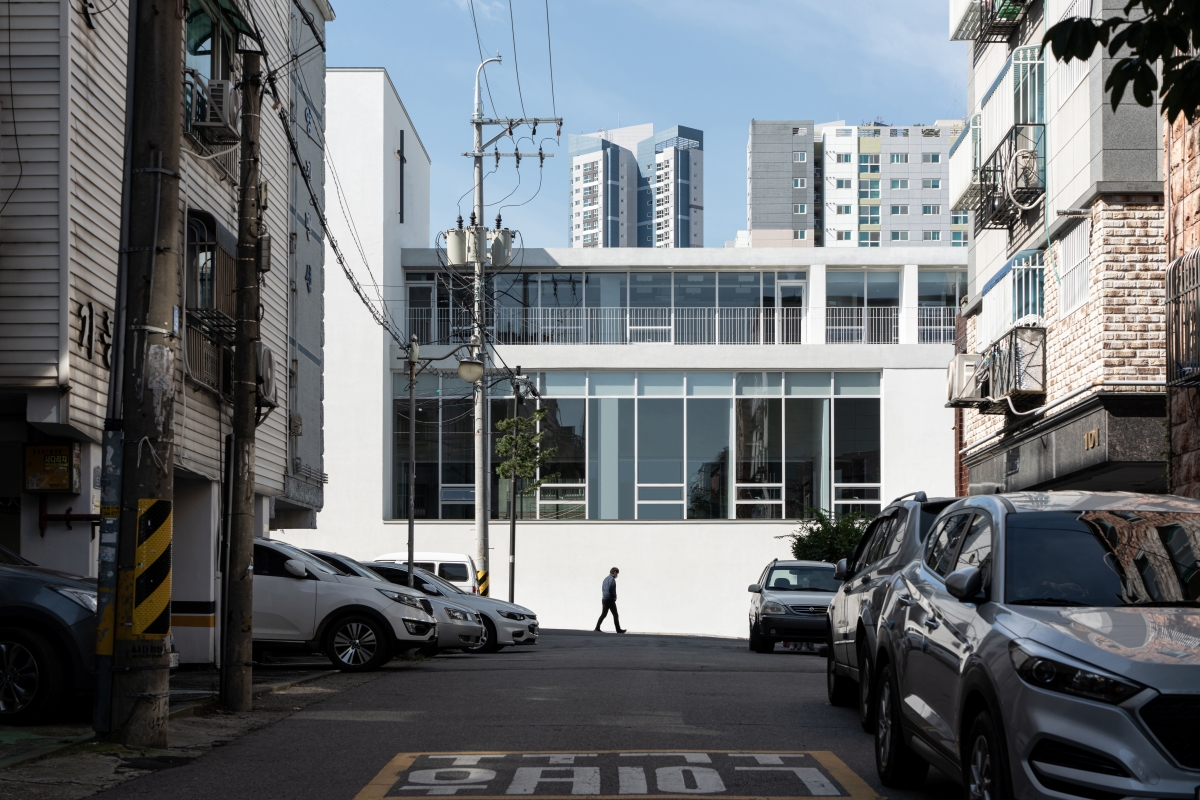
The Bucheon New Disciples Community Church is surrounded by many residential facilities. However, as there are high-rise buildings, community centres and manufacturing facilities nearby, the church doesn’t give the impression that it is located in a predominantly residential area. Neighbouring buildings seem to have been organised somewhat randomly in terms of uses and scales. On the contrary, the roads at the back of the site form a relatively clear traffic network as they cross at right angles with Gyeongin-ro’s eight-lane road of strong east-west directionality as well as with other alleys nearby. Distinction and harmony, the two impressions offered by the church, are probably influenced by such a traffic network and urban context. The new building somehow manages to deliver these two different impressions simultaneously in neither an unfamiliar nor strange way.
The three-story church was built to occupy a simple mass, but its composition reveals apparent variations with this clear intention. The mass was designed to be set back from the road to the east as it slopes upward. This solution presents a notable contrast to some other churches, whereby the design intends to make them stand out. With that said, however, the way this mass aligns with the wall on the east side of the first floor and with the wall of the staircase to present iconic verticality is also one of its most notable features. The mass of the second floor uses slabs to set two reference lines, which get thicker towards the top and thinner toward the bottom. The mass of the third floor secures diversity and draws a transparent surface deep inside by laying the roof slab so that it meets the end of the eastern wall.
When seen from the front, the church’s clearly defined mass is delicate and coordinated with discreet surfaces and lines, reminiscent of the words composition and harmony. The overall composition, which can be conceptualised as a combination of solids and voids, creates harmony through details such as the materials and colours of outer walls, the proportions of window frames, the forms and joints of balustrades, and the thicknesses of metal ornamental caps. However, what must not be skated over is the idea that governs from above. That can be interpreted as a will to prevent oneself from becoming overwhelmed, to take a step back to leave some room, and to interact with the local community.
The architect wanted this church to become an open place that could serve the local ‘community’, rather than taking a ‘puritanical’ attitude. Such a will can be read in the building’s mass as well as the distance to its surroundings. The first floor is moderately spaced from its surroundings, provoking curiosity, while the second floor is clearly open in a way so that the interior can be seen clearly from urban streets. This church seems to show us, in its gentle way, how and where a religious facility should be connected to or distinct from its city and community.
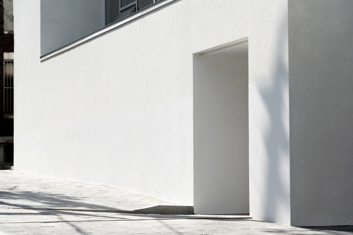
As for the most prominent point in a religious building, it is not only the design and meaning of the place itself but one’s journey from the realm of everyday life to the place that should be carefully studied. This church provides a special spatial sequence on the way to the chapel. The door to the church from an urban street dominated by low-rise houses is small and humble, yet its presence is far from unconvincing.
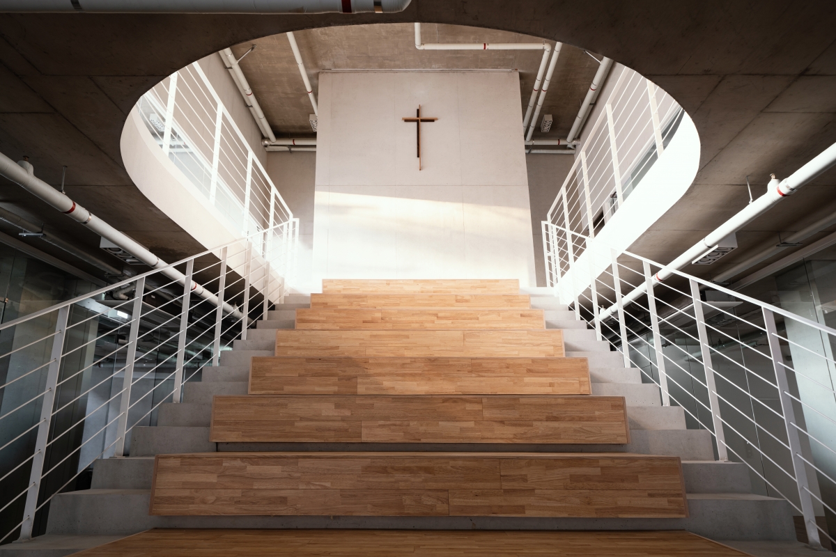
A transparent glass door, in contrast with the first floor’s windowless front façade, attracts inflows. If you walk into the church, you will be faced with a relatively large stairway to the left. The opening on the upper part of the stairway was designed to possess a partially curved form, a hint that this place plays an important role in terms of the building’s function and significance. To go upstairs, you turn 90 degrees to the left from the entrance. At the moment your eyes are set toward the new direction, you will be faced again with a large wall at the end of the stairs.
While walking up the stairs, you continually sense the presence of the wall. The closer you get to the floor level of the second floor and to the wall, the more the wall seems to push you away. Once you reach the wall that looks like a dead end, you turn 180 degrees. Then, when your eyes are set toward another new direction, you will finally see the chapel. Lights installed at regular intervals shine above two symmetrical chapel doors. These lights look like an epilogue in the journey to this place. What makes them even more remarkable, however, is the fact that this sequence has been deliberately extended under a predetermined plan by redirecting the flow. Considering that it wouldn’t be easy for a religious facility with a total floor area of around 1,000m2 to organise this kind of sequence, such efforts are even more impressive.
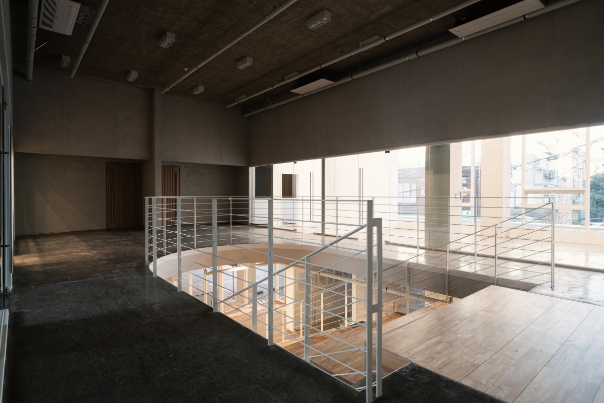
In the meantime, the volume and steepness of the stairway, the bluntness of the facing wall, and the joint between the walls with opening on both sides of the chapel and transparent walls were found to be somewhat less than satisfactory. Judging from the status of the finishing throughout, the chapel’s exposed pipes and seemingly mismatched furnishings, the budget was no doubt very tight. Nevertheless, the architect managed to go beyond practical constraints and present a unique spatial sequence by using contrasting materials, integrating functions and narratives, and diverting the course of a journey to the destination or patching it with another journey. Most part of the sequence is laid inside the building, but what marked its curious beginning is a design that sets the building back from the street to leave an interstitial space in a urban area.
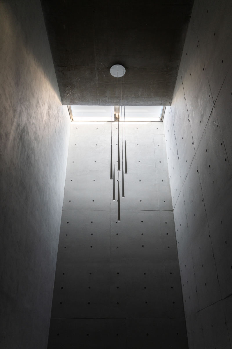
The most impressive moment is encountered on the way up to the supplementary facility on the third floor, seen after I visited the chapel. It was a place considered to be a bell tower or steeple in a symbolic sense, and as a stairwell in a functional sense. The light that poured through the skylights, an exposed concrete wall was divided into bright and dark areas. At that moment, the place looked to me at least like a vivid and not frigid place for self- examination, not a steeple or a stairwell. The light calmly separated light and shade, but it didn’t devise any extreme or sharp contrasts. The experience was impressive, and I wondered why this place had not been included as part of the sequence. I imagined the place filled with subtle, dimmed light at dawn or in the evening when the sunset sets everything aflame. This place of light, where I had the physical experience of ascent and descent, was small but not confined. Here, I imagined a person who would face up to the world and be shaken like reeds. Though may profess themselves to be atheist, I think that if those of little faith start to see their inner self more clearly they might adopt a more generous attitude towards the community. (written by Kim Sejin / edited by Choi Eunwha)
KODE Architects (Kim Minho)
18, Gyeongin-ro 398beon-gil, Bucheon-si, Gyeonggi-
religious facility (church), neighbourhood living
994.9㎡
487.67㎡
1,040.28㎡
3F
11
16.77m
49.02%
103.17%
RC
STO system, exposed concrete
exposed concrete
Aug. – Dec. 2019
Jan. – Oct. 2020
Bucheon New Disciples Community Church
www.kodearchitects.com
jiyo.co.kr


