Potential: On the Verge of Manifestation
In ЁЎThe Architecture of the Outsider: Architecture of a People Alienated from the History of ArchitectureЁЏ (Wide AR No. 56), Lee Joongyong explained the situation in Korean contemporary architecture from an outsiderЁЏs perspective and emphasised the differences between mainstream architects in the West and ЁЎ3rd zoneЁЏ/non-mainstream architects in terms of how their work is architecturally evaluated and depicted. He explains that while architecture by mainstream architects is evaluated in terms of creative outcomes, as forming philosophical/historical discussion, and as materials for architectural critique, the architecture by ЁЎ3rd zoneЁЏ/non-mainstream architects is critiqued in terms of process, outcome, existing conditions, site and sensation, and commitment to the situation. I visited Ita Lounge with Kim Hyunsu and An Youngju of eSou Architects (hereinafter eSou). The common problems that we identified ‒ the difficulty of finding the appropriate form on an unfavourable site, the challenges of working outside the capital, the potential for the design to be compromised during the cultural assets review, and possible modifications to the design to meet limited construction budget ‒ already provided enough material in order to discuss their work. However, such a one-sided approach would be inappropriate treatment of the architects and their architectural outcomes. I believe that Korean architecture has now reached a stage where one can no longer draw upon certain conditions to excuse oneself from responsibilities to their working outcome. It is no longer possible to claim that oneЁЏs work is ЁЎdoneЁЏ by comparing oneself to ЁЎlocally expected standardsЁЏ or by consoling oneself that one has ЁЎmanaged to realise the project despite the extent to which it resembles a certain work by a certain architectЁЏ. From these perspectives, Ita Lounge is a thought-provoking project.
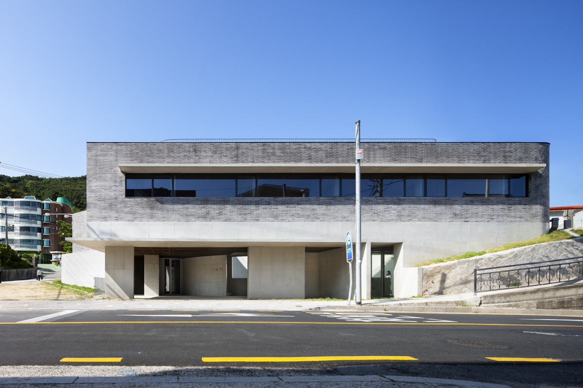
Shade and Shadow
From my impressions of the drawings and photographs, I felt that the Ita Lounge was a little different from eSouЁЏs other works. While recent projects such as Turn Around (2020) and Ascend (2019) were popular in the media (for their contemporary form, minimal and elegant design), Ita Lounge felt unrefined in terms of its composition or detail. The composition of its curved and straight lines in the floor plan seemed slightly unaligned, and the method of dividing and cutting space as depicted in the photos seemed more stoic and impassive as opposed to clear-cut and minimal.
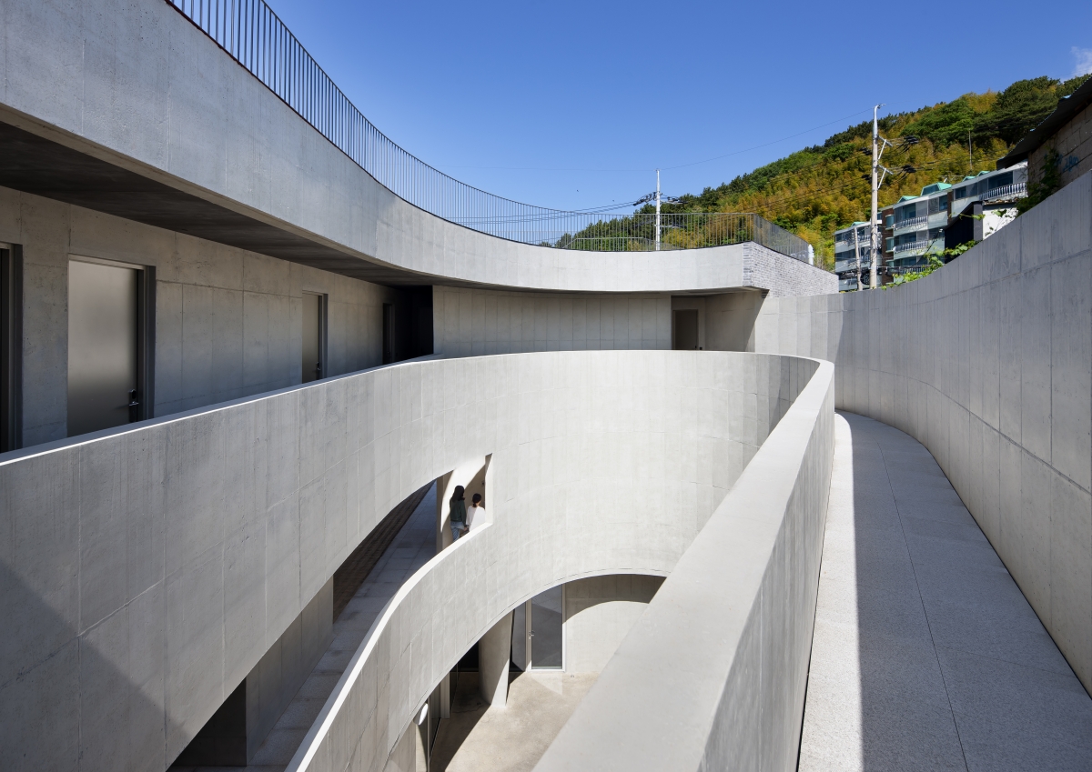
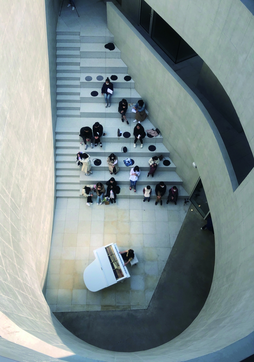
I visited Ita Lounge with such first impressions in mind, and it was much darker than expected. In spite of this, it was a fine sunny day, and the descent into the inner court felt as though I was entering an abyss. If there is to be a benchmark for darkness in contemporary architecture, this felt like going half a step beyond that benchmark. As I entered the basement café, however, I soon realised that this was the designerЁЏs intention. The café interior connected to the inner courtyard through the retractable glass walls was finished in black, and the lighting had been minimalized to lower the level of illumination throughout. I was confused for a few seconds as my eyes adjusted to this thick blanket of darkness in the café, and this sensation was similar to the experience of visiting traditional architecture. The extremely limited amount of ceiling lighting throughout the entire building suggests that the building was designed to appear not as ЁЎan adept, precise, and magnificent three-dimensional structure collected under brilliant lightЁЏ (Le Corbusier) but as a naturally-lit physical space that appears simple and yet solid. The deep inner court is close to a spatial realisation of what Junichiro Tanizaki mentioned in his In Praise of Shadows (1933). The shadow form created by the light above the inner court is eye-catching, but one can sense the gradation of the shadow itself from the middle to the base of the inner court. This distinction becomes even more striking at the point in which the arc of the curved walls of the first and second floors surrounding the inner court begin to misalign subtly with the arc of the curved walls of basement floor. I wonder if these stoic formal qualities were necessary in order to bare these shadows more clearly.
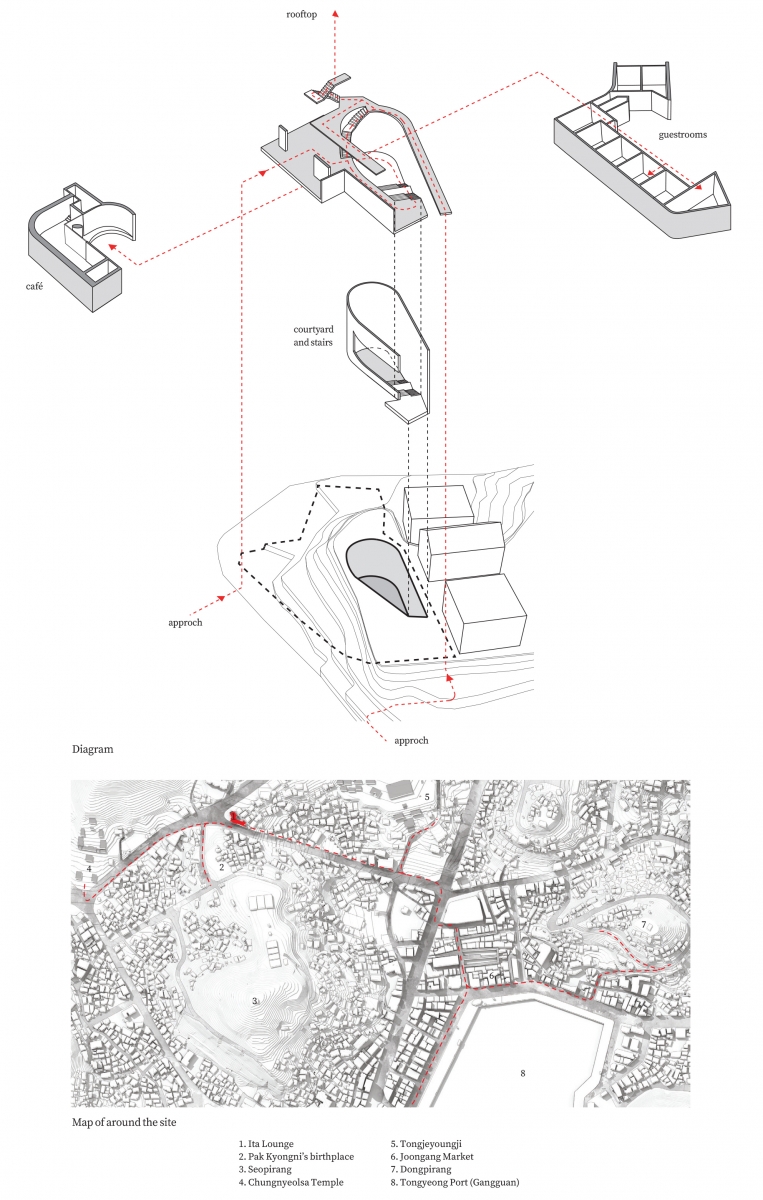
Deliberate Contradictions
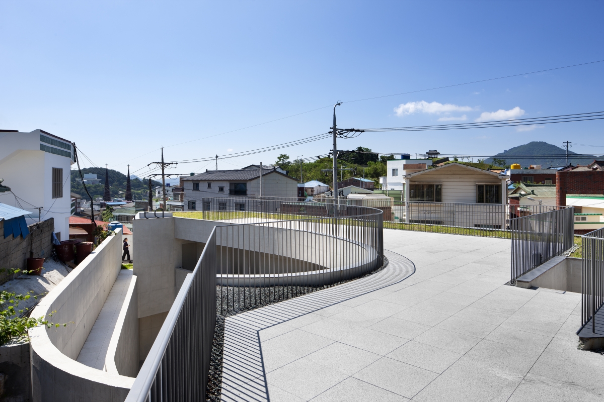
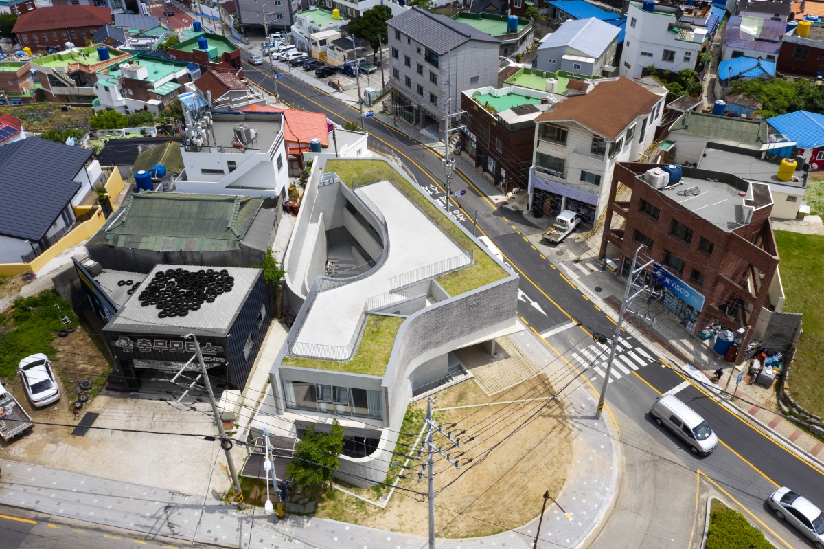
During my visit, I came to understand that the two architects allowed this misalignment, and that they believed in the force created through the combination of intangible lines. Other than a subtle deviation in the inner court wall, the exterior and interior outlines of Ita Lounge change from well per floor in accordance with the shape of the site and other needs, and these are important compositional elements. It is through such deviations that the right amount of floor space is distributed per floor, the shape overall is adjusted through the mismatched eaves of the two floors, and the imposing impression created by the retaining wall exceeding a height of 10m is mitigated and a passage is created. To explain this concept, eSou brought up the image of a little cove known as Gangguan as its key starting point and inspiration behind the design. A cove is an antinomic space that not only grants unrestricted access to vessels but also serves as a safe harbour. Like a cove, the building is connected to its exterior space through the first and second floors and all circulation lines are connected to the exterior. A significant sense of mobility and accessibility is presumed in the circulation. As I observed over a few hours at the site, the majority of visitors passed through the entire building from the basement café to the rooftop terrace with ease. The architectЁЏs intention was sufficiently communicated without the need of further explanations or signage. The tall vertical wall, however, curbs this high sense of mobility and impels visitors to stop and rest at various points such as the inner court. If previous works had the subtraction and addition of volumes as their base composition, Ita Lounge is composed of the joining and overlapping of surfaces. While inducing a certain regulated flow, this method also deliberately cuts the flow at points and puts it on hold. Here, the vertical wall surrounding the inner court and the vertical wall in guestroom C at the opposite side play an vital role; the opening which could have been widened to help people recognise the vertical wall forming the U-shaped curved surface as the corridor railing was left untouched, and the wall of guestroom C, which appears unnatural in terms of its composition, was similarly treated so as to install a pause in spatial movement. Elements that disagree with the overall composition come together to evoke a sense of duality in movement and stasis. Considering this composition, what remains slightly disappointing is the terrace space. There is a discrepancy here by which the relatively static façade is not as well revealed. The line of the eaves on the first floor creates a limited tension by protruding slightly in a diagonal direction, but its relationship with the interior remains unclear. I wondered if the space could have become more multifaceted if the divergence was also applied to the walking trails and the landscape on the rooftop. Excluding the black bricks used on the façade facing the main street, the entire building was finished with exposed concrete. Post-processing was done on the Euro Form to create a subtly-textured surface that is neither too smooth nor too rough. Consequently, the design of the Ita Lounge became more liberal than the composition of Tadao Ando associated with these materials, heavier than Alvaro SizaЁЏs composition associated with curved surface lines (Siza focuses on lightness and weightlessness), and more delicate than that of brutalist architecture.
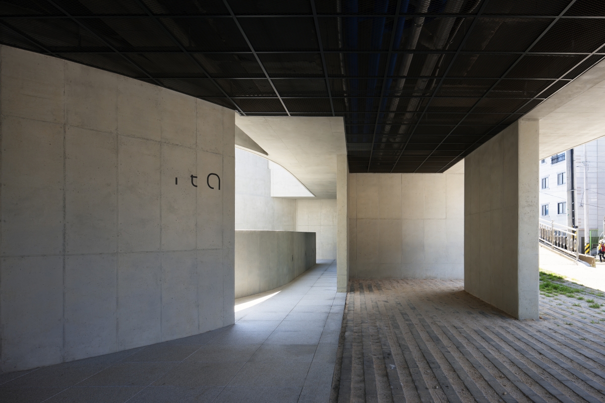
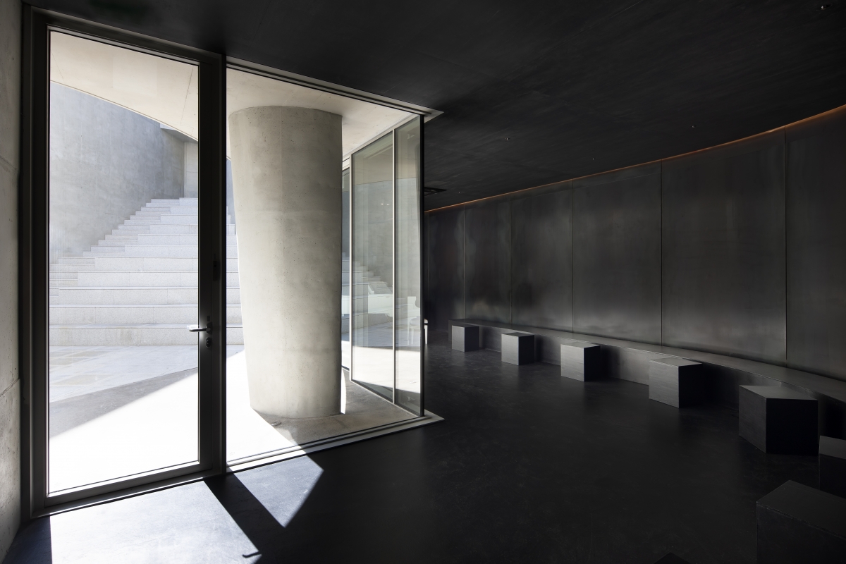
Prototype in the Middle Zone
Personally, I perceive the architecture by architects in Korea who are serious about their work to adopt two separate tendencies. One is the tendency to pursue a ЁЎsincere and pureЁЏ architecture of elegant form and detailing, and the other is the tendency to seek a programme and context of an ЁЎas it isЁЏ approach with disapproval for form itself (conscious of not only ornamentation but of form, even treated as something of a taboo). Under this classification, Ita Lounge is a new prototype that belongs in the middle between the two. The passion for shape from the architect is subdued, and while respecting the context, the design is not subsumed by it.
There are two roles for a ЁЎprototypeЁЏ in architecture. One is to be an architectural example for the future generation, and the other is to be as a contribution to part of our road, town, and urban landscape through its repetition. While Ita Lounge would belong to the latter, I also think that the property that the two architects hoped to realise has the potential to be transmitted to the next generation through its reinterpretation of a spatial sensitivity that has long existed in us.
I have been carefully reading the recently published article from SPACE entitled ЁЎDialogue with Architects from Southeast AsiaЁЏ, and what struck me most was the fact that young architects in Southeast Asia were trying ЁЎto explain architecture through oneЁЏs own languageЁЏ. I wonder if this is the kind of approach that eSou needs at this moment. So as to not have my intentions misinterpreted by the readers of this text, what I mean is that eSou needs to develop a more specific system and technique of its own. Ita Lounge came to me as a starting point that announces the transformation in eSouЁЏs work. I hope that this attempt will not dwindle in its efforts as one of a series of spinoffs brought about by a given condition, site, and situation connected to the project. (written by Nam Soohyoun / edited by Bang Yukyung)
ЈЯeSou Architects
eSou Architects (Kim Hyunsu, An Youngju)
Kang Sangcheol, Kim Hyejin, Lee Jueun, Oh Jaehyeok
3, Seomun 1-gil, Tongyeong-si, Gyeongsangnam-do, K
accommodation, neighbourhood living facility
475ЇГ
240.81ЇГ
467.45ЇГ
B1, 2F
4
6.46m
50.7%
76.28%
RC
exposed concrete, brick
exposed concrete, wood, steel plate
Kun Architectural Structural Engineers
Sehyeon ENC
Changwon Electric Engineering
Jinsong Construction Co.
Nov. 2016 – Feb. 2018
May 2018 – Oct. 2019
Kim Youngkwang


