Memory of a Place and Expansion of a Boundary
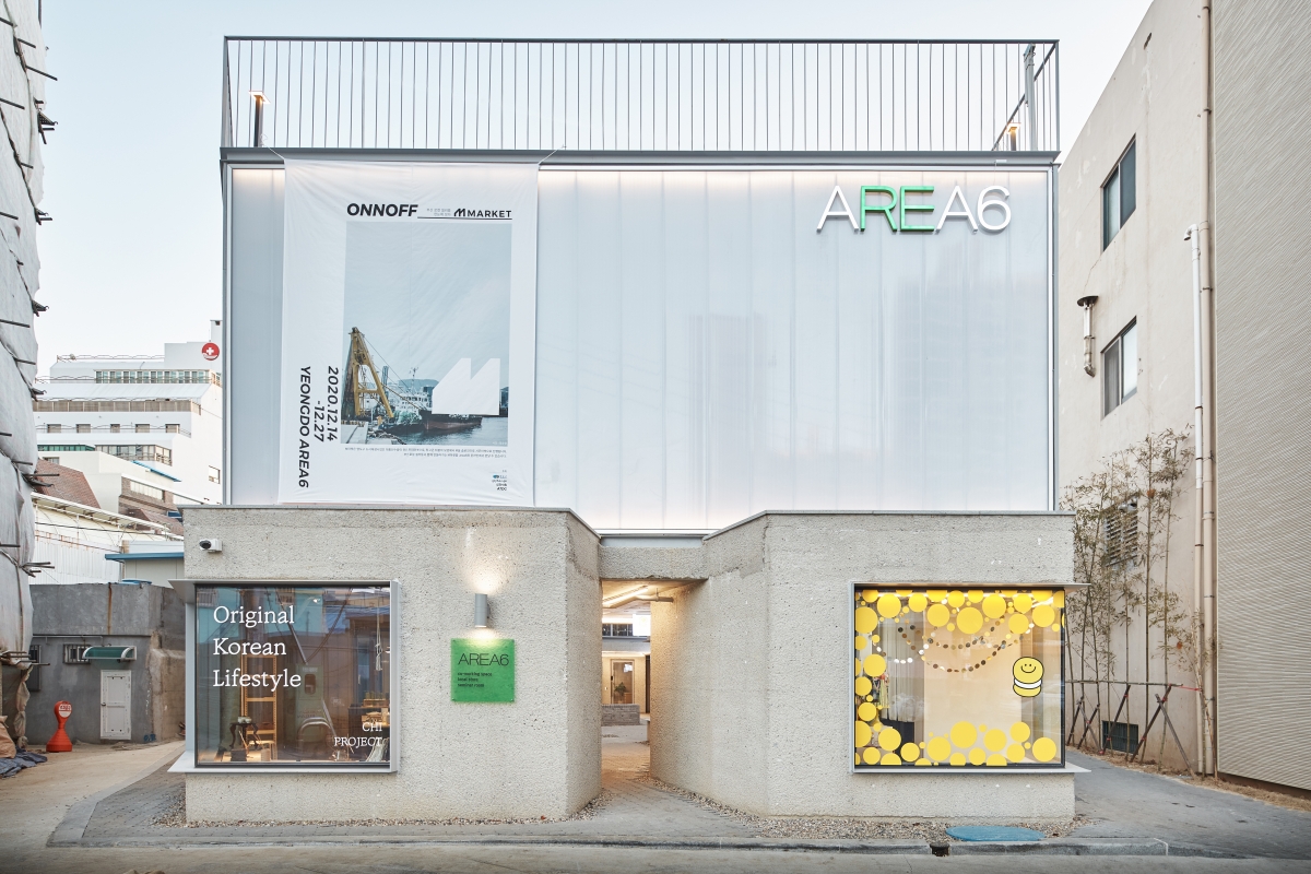
A three-generation old family business founded in 1953 is running AREA6, a symbolic regional project intending to boost urban regeneration. The site is located right next to the company’s headquarters; a good location to connect the two spaces, and facing Bongrae Market, a traditional market on the opposite side. At first glance, the project may appear to form part of a private project, but the intention was in fact to create a building that would serve as pump-priming to encourage development in the local community. With a shrinking population, the Yeongdo area has inclined to the point that the number of vacant houses in the area ranked at the top in all of Busan. Careful consideration of the site’s coexistence with its surroundings was of course important from outset.
New Memory of a Place
Architecture and urban regeneration can be thought of as covering not only the remodeling of old buildings, but also providing new value that can have a positive impact on the interior and exterior including the surroundings of the existing place. In other words, a change of a location may mean remodeling or creating a new building. The important thing is to make good use of the meaning and the memory of a place so that it can communicate with the surroundings in a positive way. In this respect, this project succeeded in creating an intermediary space to encourage various cultural activities as well as a base for small business owners through a new building with memory of the site. As implied by the title, AREA6, six old houses in the old city centre have been renovated to form a new platform and illuminate the neighbourhood.
Regarding the Space (Place)
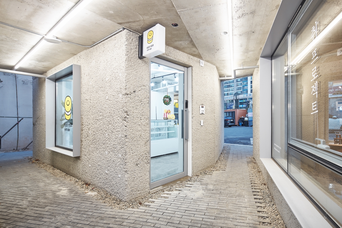
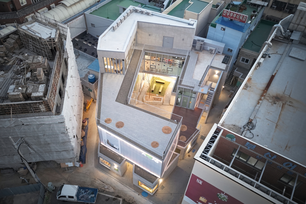
The first floor of the building consists of nine rooms of different sizes. The architect explained that he first devised the outline of the building by maintaining as much of an irregular site boundary as possible and adjusted the layout of the space to create alleyways between the existing six houses across their layout. He divided the mass by partially projecting the memory of the narrow alleyways onto the entrance, and created a courtyard for vehicles by widening the alleyway leading to Bongrae Market. In the end, the building’s form was developed to honour the memory of the place in the most eloquent way.
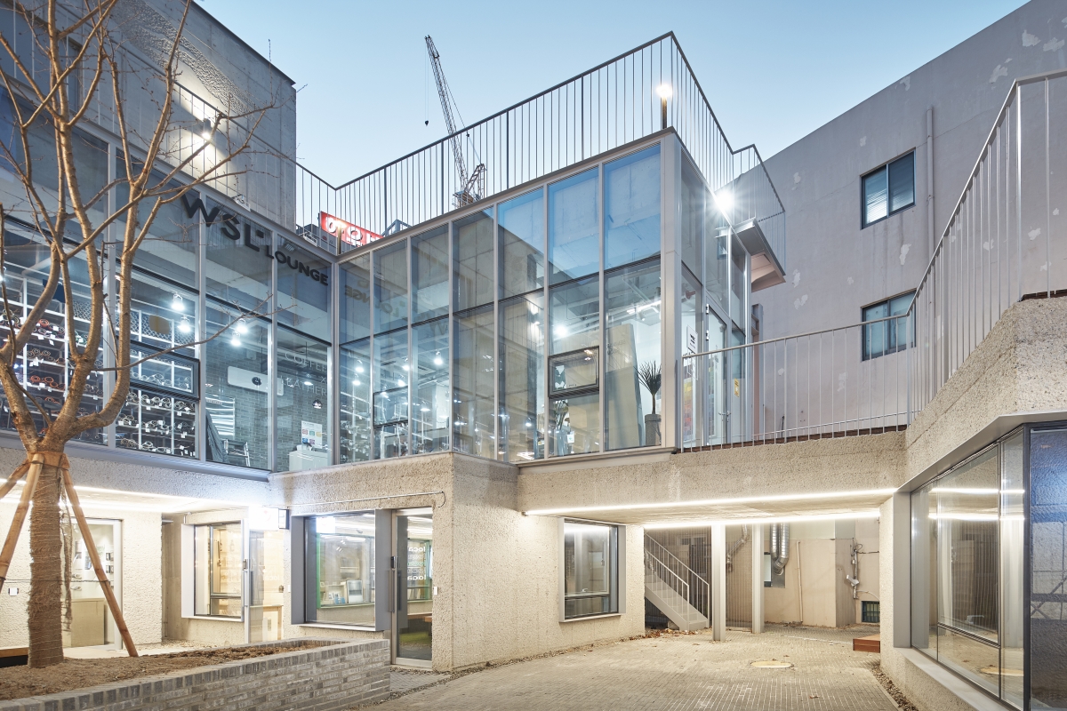
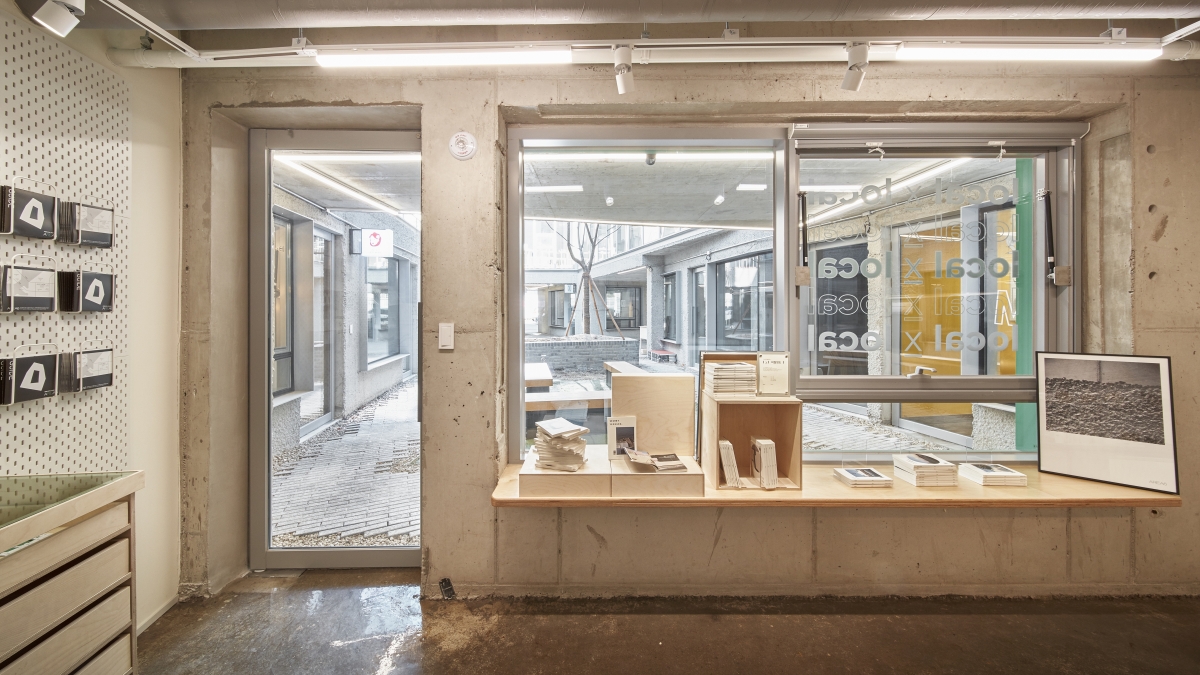
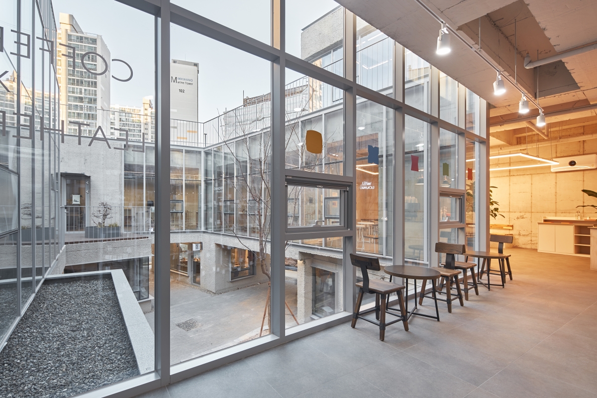
As a consequence of sitting adjacent to old houses and the traditional market, comprehensive fire protection was deemed necessary. Instead of windows facing outwards, most rooms had to face the courtyard. Focusing the attention of building users on one place, the legal restrictions provided an opportunity to respect the privacy of adjacent buildings and apply various programmes around the courtyard. It is of particularly note that the courtyard was originally planned as a parking lot, but it could be used as a void space as the client succeeded in securing parking spaces near the site. In other words, this courtyard became not only the centre of the building but also a passageway connecting the surrounding facilities, a meeting place, and a space for various performances and events. In fact,
it is claimed that a growing number of local people and tourists intentionally pass through this courtyard on their way to the market, enhancing connections to the market, and has a positive effect on the stores in the building by providing pedestrians with attractions and convenience in terms of circulation.
In addition, the spatial changes caused by inevitable revisions to the design as a result of various factors are intriguing. First, the size of the building increased from two to three storeys as the machine room on the basement floor was moved to the ground floor due to a management problem. Accordingly, a seminar space was devised on the third floor, and the public space became more plentiful after forging a connection to the outside terrace. The increase of the overall building height emphasises its visibility from the outside, and this provided an opportunity to underline the distinction of the space across every floor. And then, regarding the second floor, it is said that initially it was planned to be an enclosed space with rounded circulation in a rectangular plan. However, as a staircase in the courtyard was moved to the outside of the building, the part adjacent to the staircase was transformed into a terrace space, which is not completely connected to the inside but forms a C shape with a cut in the middle. This new addition could serve as an external platform overlooking the courtyard, provide an open space capable of opening up the courtyard a little more, and function as a reference point to divide programmes on the second floor.
Unfinished Story
The initial plan for this project featured two connecting passages linked to the headquarters. However, once the two buildings are connected, this is not regarded as a new construction but an extension, which may influence the main design in consideration of factors other than urban regeneration, the main aim of this new space. Therefore, considering all those external factors, the project is now considered as a separate building. In addition, the toilets on the first floor of the new building have been placed outside, near the headquarters, to provide greater convenience to both sides. However, this is also attractive as it offers a glimpse of the healthy discomfort sought for the hanok, encouraging people to experience the changing seasons and external environment, and to momentarily escape the confines of interior space.
However, it would have been better if devices had been provided to help elderly occupants to climb the stairs more easily. This is obviously regrettable as this project was informed by the aim of a public space accessible to all. In addition, it is said that the cherry trees in the courtyard, which were originally planted at the ground level on the first floor, withered due to the high salinity of soil in Yeongdo, and were replanted on high bases that seemed to divide the courtyard. I wish the space could have been more open.
The architect said he could reflect original concepts in a more active way based on the belief of the client in this project and created a building that could contain various stories. I would like to praise the architect’s judgments and the client’s decisions and the ways in which they opened an opportunity for the building to find a better direction. Moreover, it is really significant that a leading company of Yeongdo played an active role in creating a symbolic building that would benefit the region, and it must be regarded as an exemplary regeneration project not just in this region but in terms of those in other regions. At the micro-level, the symbolic platform for the region seems to have expanded the physical area of the existing headquarters, but seen at the macro-level, the boundary has been expanded to the city centre serving as a means of pump-priming that can positively affect the local environment. This project succeeded in creating a new building based on the memory of the place in tandem with the contemporary reality of the region, and yet it still illuminates the future of Yeongdo by creating a subtle link between people and their neighbours. (written by Eom Junsik / edited by Choi Eunhwa)
GAGAHOHO Architects (O Seungtae)
O Seungtae, Kim Junhyeong, Choi Yoonjung
37-3, Taejong-ro 105beon-gil, Yeongdo-gu, Busan, K
neighbourhood living facility
485.41㎡
310.97㎡
541.83㎡
3F
4
12.25m
64.06%
102.93%
RC
exposed concrete, polycarbonate, THK24 Low-E doubl
exposed concrete, paint on gypsum board
SDM partners
Senc engineering & consulting
Daejeong construction Co., Ltd
Mar. 2018 – Dec. 2019
Jan. – July 2020
Samjin Food
www.gagahohoarchi.com


