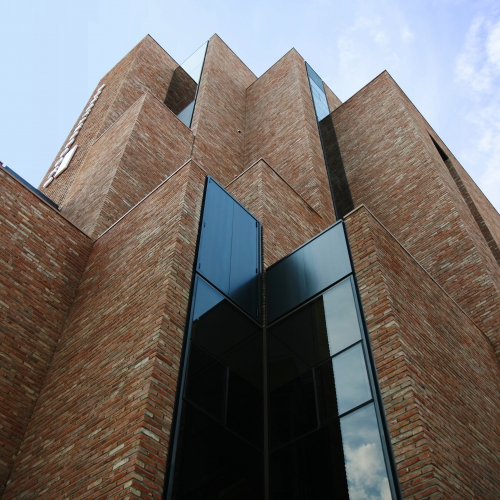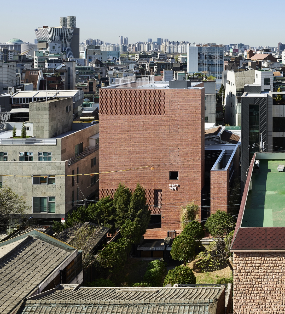
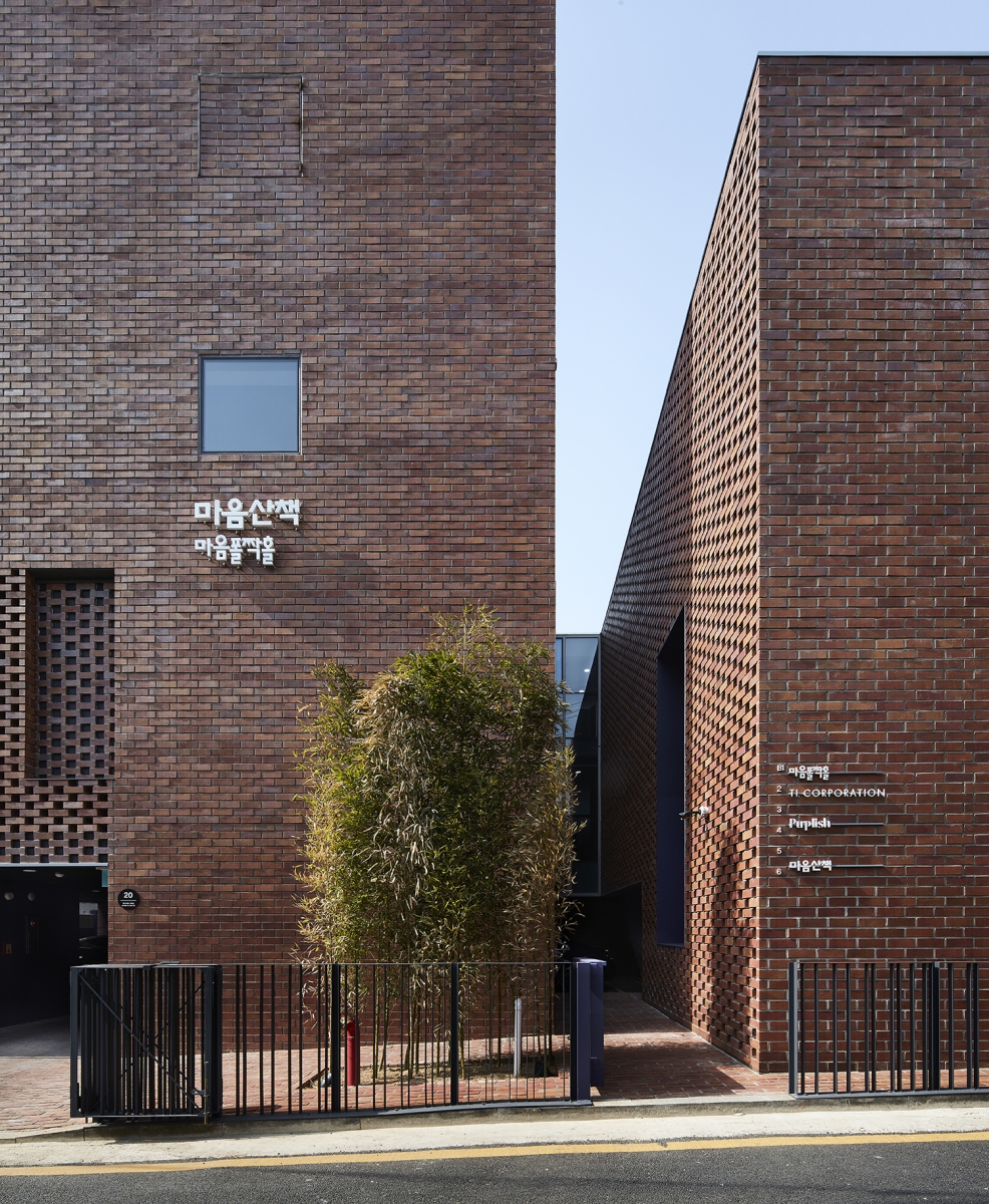
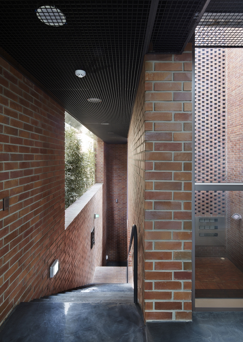
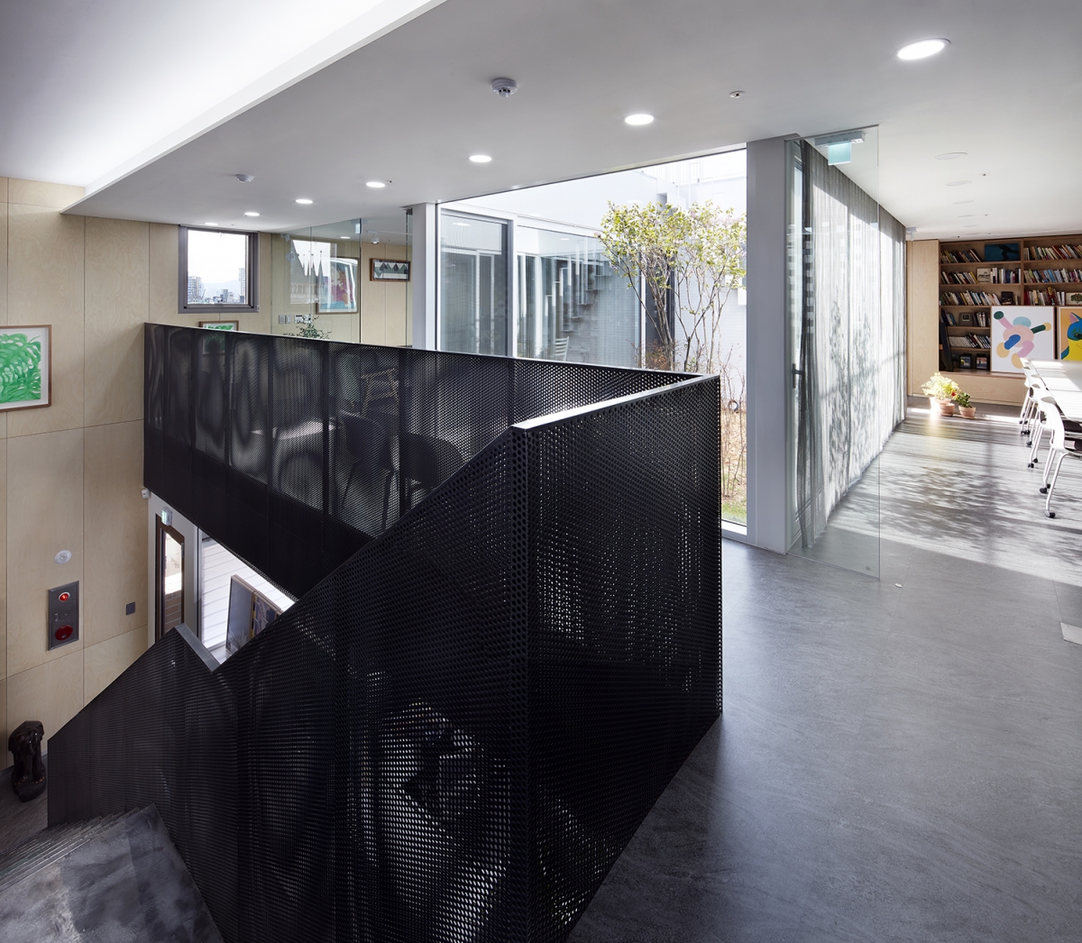
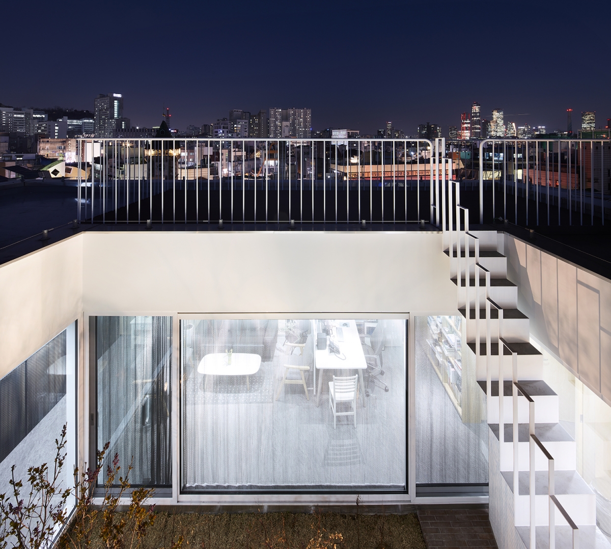
The client, who was already familiar with Eunhaengnamu Publishing Co. Office, said on our first day of meeting, ЁЎI would love for it to be a closed structure with a square block in the form of a bookЁЏ. Due to the limitations imposed by the daylight restriction code, a square box mass was impossible due to the site conditions, and, as I teach my students at a school, a building should seek to harmonise with its urban context. It was a bit difficult, but I expected it to be a project through which the impression of architecture could be fully transmitted. The client had already set a date for delivery and he was happy to receive it. I wanted it to be solid and simple on the outside, and rich enough on the inside. We did what we could to avoid a crushed mass as could have derived from the daylight restrictions code. I wanted the building to be more classical than the shallow commercial buildings on the street, and I wanted it to stand still with a strong posture. These were again my boundaries.On the northern side of the site, which is affected by the daylight restriction code, an outdoor staircase begins in a low but independent, solid, good proportional mass to wraps around the entire building. Although the five storey building can also take up the maximum gross floor area, the programmes inside were zoned up to the sixth floor in order to raise the mass as high as possible. At the northern extent of the lower mass, the elevator hall has been attached as if it was a towering mass. The narrow and high gap between the two towers, seemingly slender brotherly towers, becomes the main entrance to the building.The staircase that leads from the basement to the top floor in a spiral, where the entry and the end meet, offers a means of comprehending the architecture. It is situated between the energy of the city and a more mindful pace. Things on the outside – sounds, smells, sunlight, wind, and rain – are filtered through this outdoor lighting. The height and centrality of this building can be felt by walking around a rather long, red brick staircase passage with different spaces and openings on each floor. At the bottom of the staircase passage is a lecture hall where readers can gather, and on the top floor there is a garden with lilacs and Namcheon trees (Nandina domestica THUNB.) which opens to the sky. Like a rhyme scheme, the lecture hall and the interior of the sixth floor were finished with the same birch plywood. When you finally climb the steep iron stairs in the courtyard, you reach a rooftop deck that looks like a ship deck. The view to Yeouido is open, and it occupies the highest point in the surrounding area. The result was fortunate; a firm but also gentle object clothed in purple was delivered successfully. (written by Lim Dokyun / edited by Bang Yukyung)
Luyoun Architects (Lim Dokyun)
Lim Dokyun, Seo Minjeong, Han Seungmin
20, Jandari-ro 3an-gil, Mapo-gu, Seoul, Korea
neighbourhood living facility
293.2ЇГ
165.91ЇГ
928.77ЇГ
B1, 6F
7
19.9m
56.59%
239.68%
RC
brick, Low-E pair glass
betulaceous plywood, color epoxy coating
Chang Minwoo Structural Consultant
Chunglim Mechanical Engineering
Acepartners Engineering
Gunyang Construction
Oct. 2019 – Jan. 2020
Feb. 2020 – Jan. 2021
Maumsanchaek


