A Very Subtle Boundary
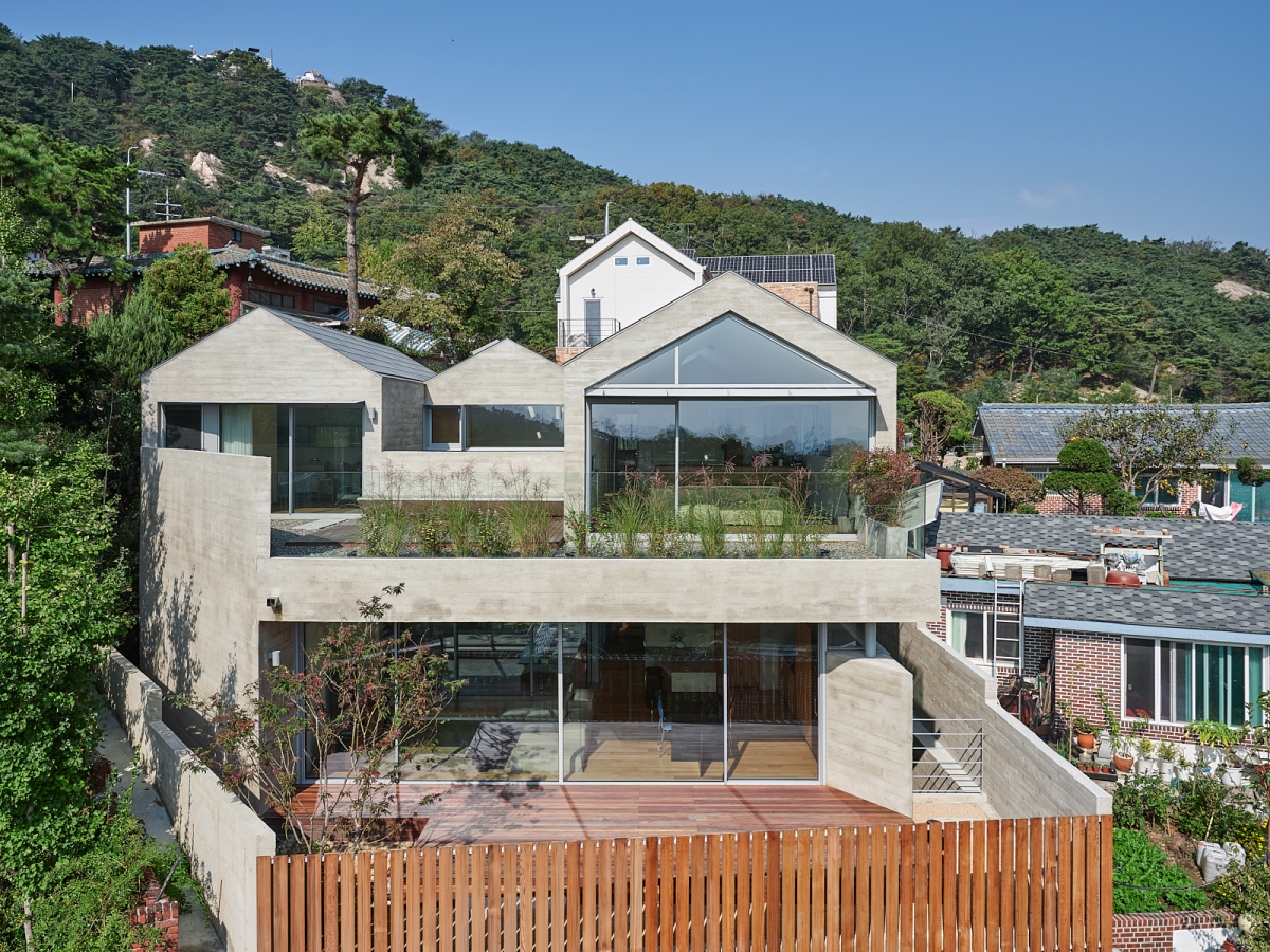
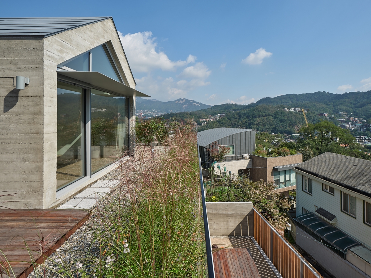
Doo Jip is a house for two branches of one family, and there crossing and separation take place at the same time. The design of this house is inspired from the relationship between the two parties. The parents and their sonЁЏs family decided to live together after 10 years of separation. The impression gained from the site at the first visit before proceeding design work was about ЁЎheightЁЏ. The site was sitting on a hillside of Inwangsan mountain, so it had a high altitude and a steep slope. And there was a 5m-high embankment at the entry to the site. The town was densely packed, and thus the work environment was not favorable for construction. Even land records didnЁЏt match the actual situation. The overall circumstances were very challenging. However, the view from the site was stunning as much as you can forget about all the difficulties. If you stood on the embankment, you could enjoy views of the town and mountains. So obviously, the houseЁЏs arrangement plan is developed in a way to fully enjoy these views. But still, there was one more important task awaiting solution. This house was planned as a seemingly single-family home for two families, therefore it needed to have a ЁЎvery subtle boundaryЁЏ which can ensure privacy for both but at the same time avoid giving an impression of complete separation.
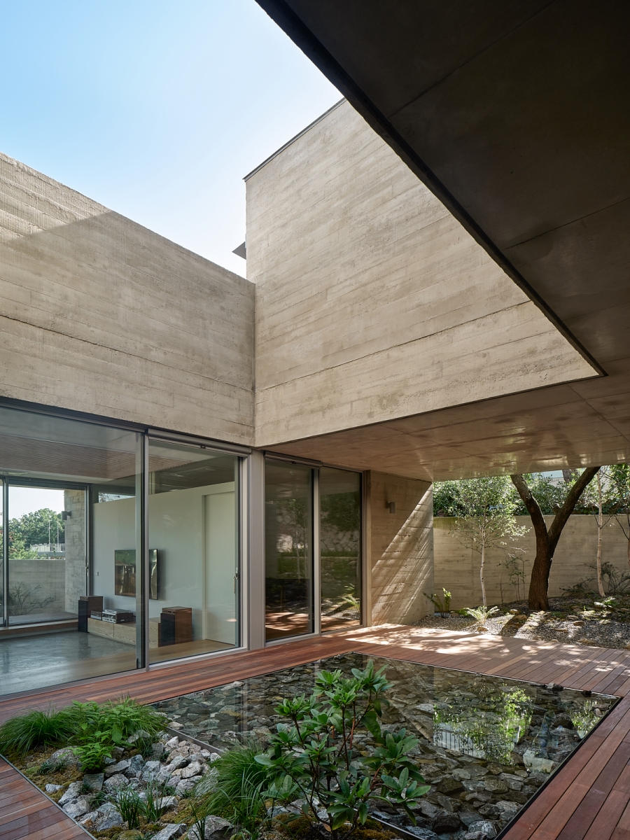
At first, two buildings for the two families to live independently were put side by side. This arrangement is effective in creating a private living space but inconvenient to share one garden. If we divided the outdoor space, the house would have looked like two buildings independently built on two small lots; the families would not have been able to feel that they are living together. However, if we designed the house in a way to share one courtyard, it would have degenerated into an underused land that compels residents to show unlimited tolerance and care to each other. Such a land use plan seemed to be ineffective for a lot with an area of 100 pyeong (apprx. 330fЇГ) in Seoul.With the aim of using the site area more efficiently, we tried to find a way to have two horizontally divided units within one building. And we decided to exclusively give a courtyard to the unit on the first floor, and a stunning view to the other one on the second floor. We assigned the first floor to the parents who spend much of their time at home after retirement, and the second floor, to their son and his wife who are frequented by visitors and thus in need of a room. And then, we started seeking a solution to prevent the residents from intruding into each otherЁЏs territory and create a small marginal space. The common basic design strategy that uses the roof of the first story as an outdoor space for the second story is adopted, and a courtyard is added to the first floor. This void serves as a little niche that marks a boundary between private spaces of the two families and at the same time allows them to communicate each other. As for the windows of the second floor facing the courtyard, they are installed at a height that shows a view of people downstairs only when one stands very close to them; this enables residents to adjust the distance to the first floor as they please.


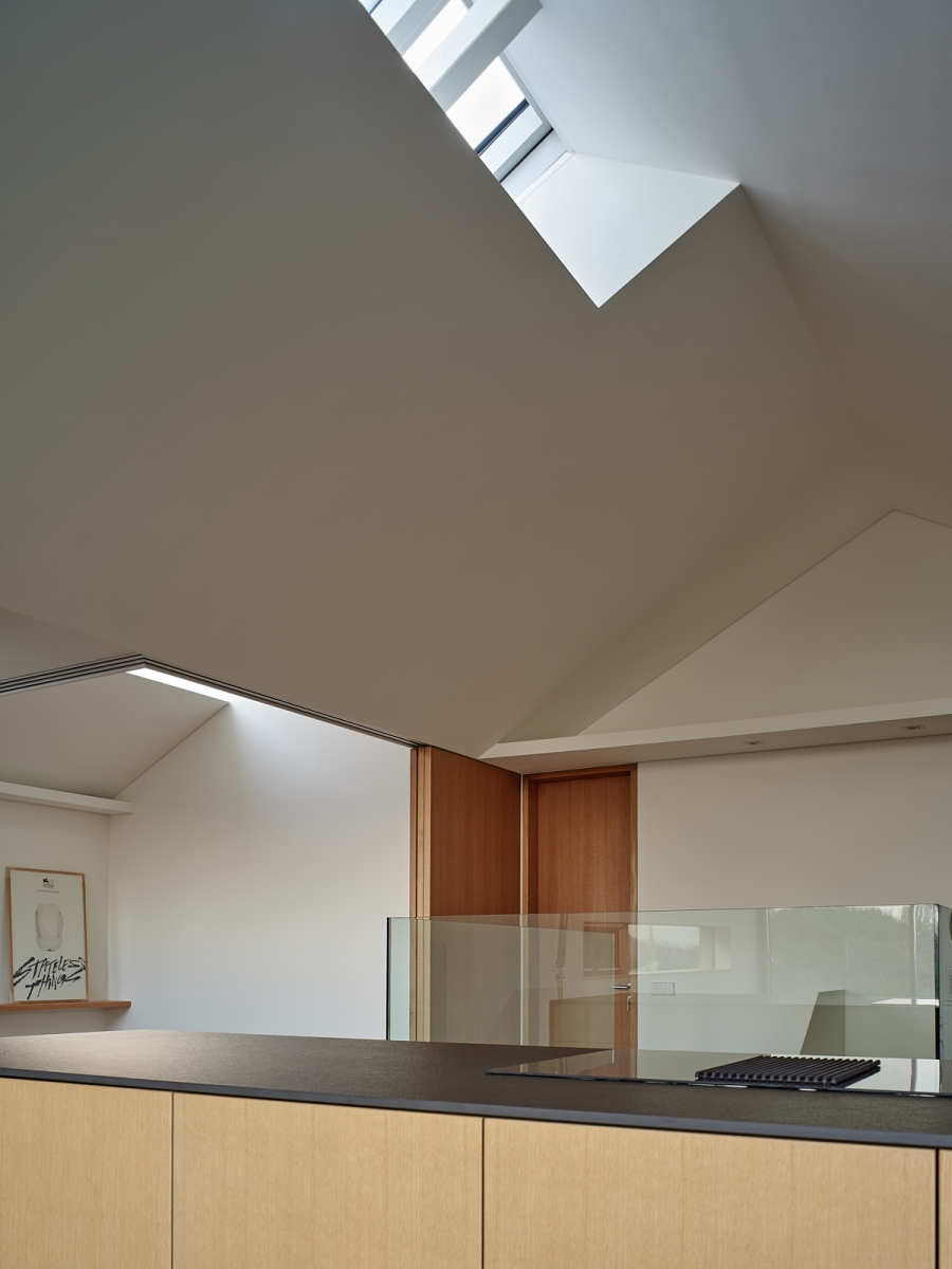
The courtyard-centered arrangement system allows the house to have a floor plan efficient for natural lighting and ventilation while meeting expectations on a garden for the two families who have decided to leave their apartment and live in a detached house for the first time. Also, a water space and a garden are added to this courtyard house as a place for having a rest. In the courtyard, there is a water space covered with large broken stones. It was hoped that the sky could come inside the house through this rectangular water space by casting a reflection on its surface. A 40-year-old apricot tree in one corner of the garden is preserved to keep memories of the site. Working on a small lot without removing such a large tree was extremely difficult. The apricot tree now has become the first thing you see at the porch; it is serving as a symbol for this house. The second floor for the son and his wife has a terrace with good natural lighting and a stunning view. There you can enjoy a beautiful view of the streets of Seoul and mountains on three sides, so it is much sought after. Doubling as the long eaves of the first floor, the terrace of the second floor blocks each otherЁЏs sight lines that could feel uncomfortable. And with its front filled with Cyperaceae plants, it makes people feel the pleasing sway of a good windy day. When the terrace provides a wide-open view for residents to enjoy a picturesque scene, skylights bring the warm sunshine inside. For the house, skylights are installed in several places. They serve to complement sunlight from the east which the house is positioned to face. In terms of form, they are tilted to match the shape of the roof so that they can block direct sunlight in summer and bring sunlight deep inside in winter. The angle of sunlight that changes throughout the seasons is another thing that you can enjoy in this house.
It was not an easy task to blend different lifestyles of two families under the same roof. But working in Buam-dong with a poor construction environment provided valuable experience through which vague ideas about suburban housing area regeneration projects could evolve into a level-headed and realistic perspective. We carried out concrete placing work on a 4m-wide sloping road in a cul-de-sac, and through that process, we could clearly learn why it is essential for a road to have a width of more than 6m. Despite all of these, the work of polishing and embellishing an old and deteriorated place to restore its own charm is always interesting and meaningful.


Archihood WЁПY
Kang Woohyun, Kang Youngjin
Buam-dong, Jongno-gu, Seoul, Korea
multi-family housing
389.87ЇГ
191.9ЇГ
376.95ЇГ
B1, 2F
4
8.44m
49.22%
76.88%
reinforced concrete, steel structure (roof)
exposed concrete, wooden louver
water paint, concrete hardener, wood flooring
S.D.M structural consulting engineers
Seonhwa Co., Ltd.
Seonhwa
Kang Gookhyun, Artek (Lee Cheolhee)
Jan. 2017 – Mar. 2018
Apr. 2018 – Aug. 2019
Anmadang The Lab, Space A1
Kang Youngjin graduated from the Department of Architectural Engineering at Hongik University and worked at BCHO Partners.
Archihood WЁПY is located in Seoul, Korea and was founded in 2013 by Kang Woohyun and Kang Youngjin. Its design philosophy is to provide a good and friendly design for everyone like to meet their friendly neighbour. Archihood WЁПY design work is focused on ЁЎgaps and boundariesЁЏ and ЁЎfamiliarity and noveltyЁЏ. Its recent works include Seorimyeonga, Gap House, Korean Dandelion Farm. They also received the Korean Architecture Award and the Korea Rising Architect Award.


