A Balance between Contradictory Urban Contexts
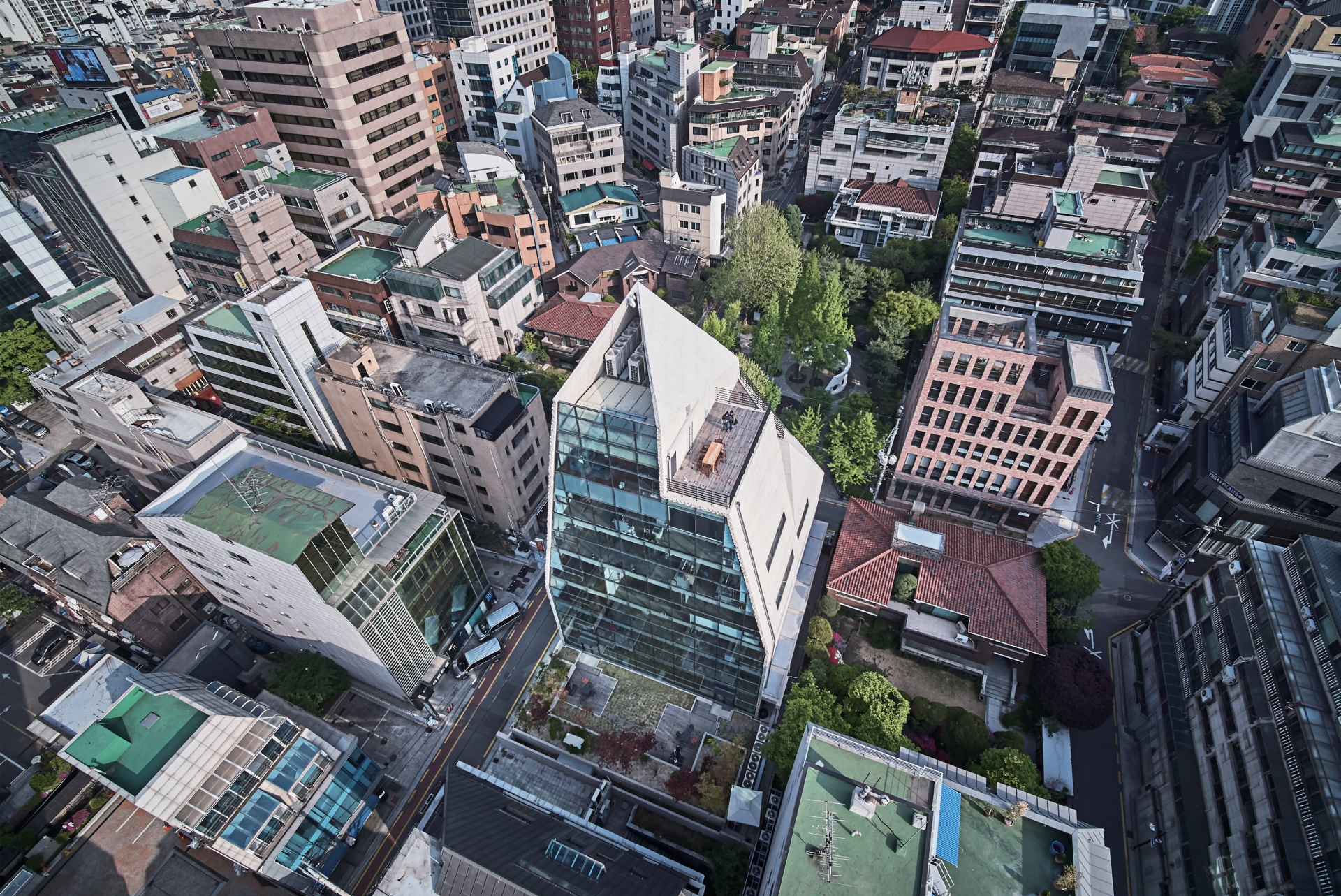
ITOWER is located a few blocks from Gangnam’s business district, a symbol of modern Seoul that features a concentration of commerce, corporate and residential areas where one can find many digital design advertisement agencies. These characteristics of the location, coupled with the emerging digital advertising brand’s demand for a ‘new type of office building’, meant that there was a need to incorporate functional flexibility, efficiency and symbolic significance. To further illustrate the context, the site is located on a block corner and faces a small park to the north, around which there are residential buildings of three to five stories. Facing the park to the north and the business district’s high rise buildings to the south, the design had to find a balance between the neighborhood’s public space and the urban landscape, seeking to engage and not to disrupt.
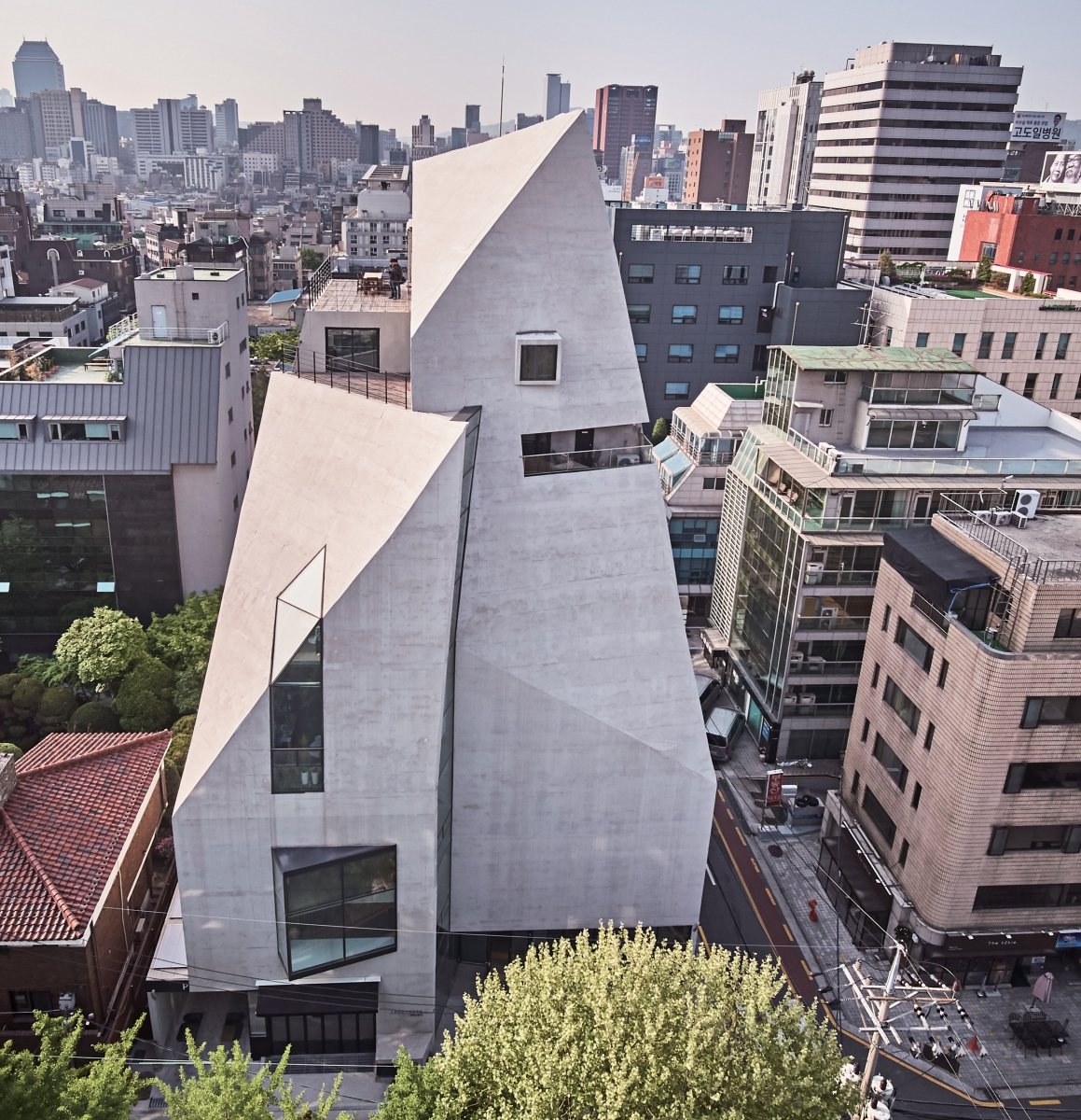
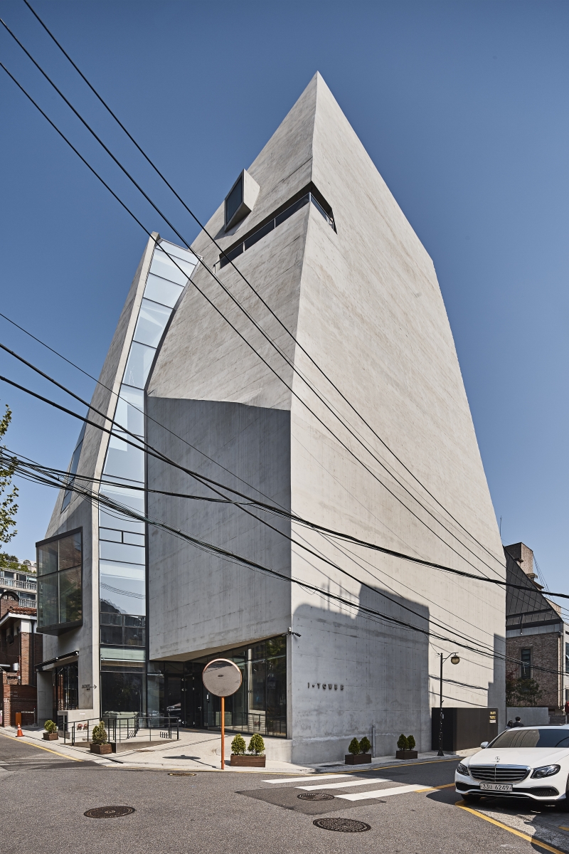
Although comprised of one space, the mass is divided into three parts, each of which border each other in gaps and cracks that, through projecting shapes in the ambient light, amplify the sense of fragmentation in the space and allow the mass to overcome the monotony of concrete.
The site is located on a block corner and faces a small park to the north, around which there are residential buildings of three to five stories. Facing the park to the north and the business district’s high rise buildings to the south, the design had to find a balance between the neighborhood’s public space and the urban landscape, seeking to engage and not to disrupt.
Although comprised of one space, the mass is divided into three parts, each of which border each other in gaps and cracks that, through projecting shapes in the ambient light, amplify the sense of fragmentation in the space and allow the mass to overcome the monotony of concrete. To build a comprehensive floor plan with compact core elements required establishing efficiency in the space
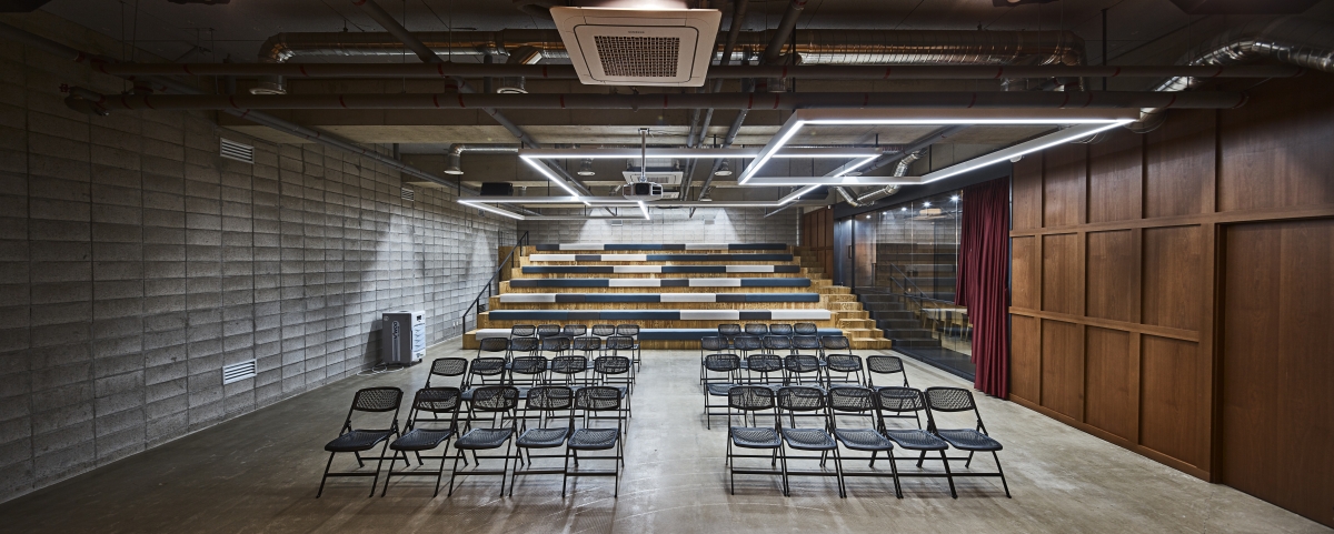
The building houses a parking lot at the first basement level and a 250 seat multipurpose theatre at the second basement level with a separate entrance.
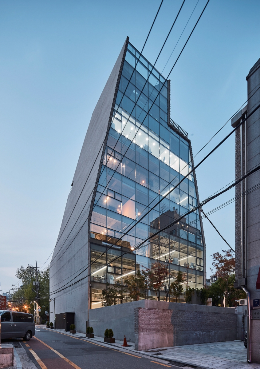
Like a sliced apple, the southern face of the concrete mass is made of glass to allow sunlight to permeate the space, and the rough contrast between the smooth glass and the rough texture of the sliced concrete communicates that the mass is broken or fragmented. This building features a design with the requisite accuracy in function demanded by a new business, flexibility to endure changing times, a form that will be widely recognised as the symbol of a new brand, and a harmony between sculptural aspects and cosmopolitanism in response to the residential and urban context. This shows that in modern architecture, functional efficiency, flexibility and symbolic form can complement one another rather than contradict.
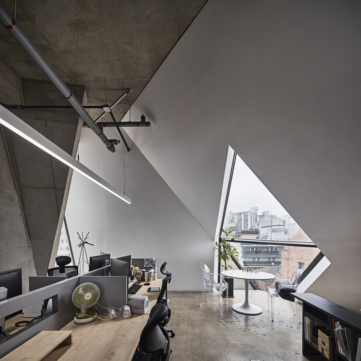
The outer concrete envelope functions structurally like an arch, removing the need for more than one column in the interior space, further maximizing the efficiency and flexibility of the office space.
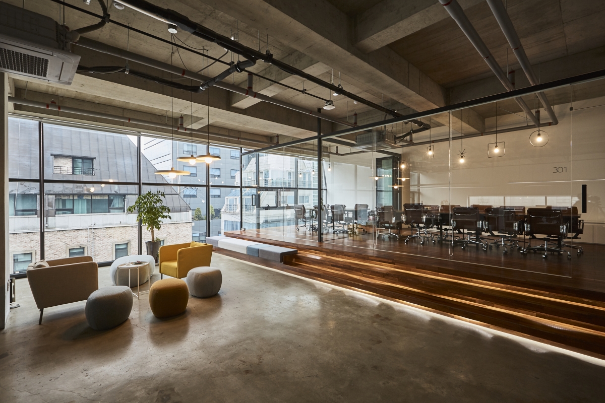
A quarter of the square area in each floor plan serves the rest of the floor through the core functions of vertical circulation, bathroom and kitchen, and this service space is vertically compact at 3m. The rest of the floor is a big, open space at a height of 4.5m, and can be used not just for office work but also events, performances, exhibitions and other programmes.
Chiasmus Partners (Lee Hyunho)
Park Youngjong, Yang Narae, Lee Sangwha
10 Hakdong-ro 3-gil, Gangnam-gu, Seoul, Korea
office
752.4m²
367.2m²
3,083.48m²
B2, 8F
23
39m
39m
248.34%
reinforced concrete
exposed concrete, glass curtainwall
exposed concrete, painiting
Cheil Structure Lab (Park Joohyun)
SeungJin Eng. Inc
Coremsys, Inc
Dec. 2015 – Jan. 2016
Apr. 2016 – June 2017
4 million USD
Moon Joonho
Nomura Chika, Huh Yeseul


