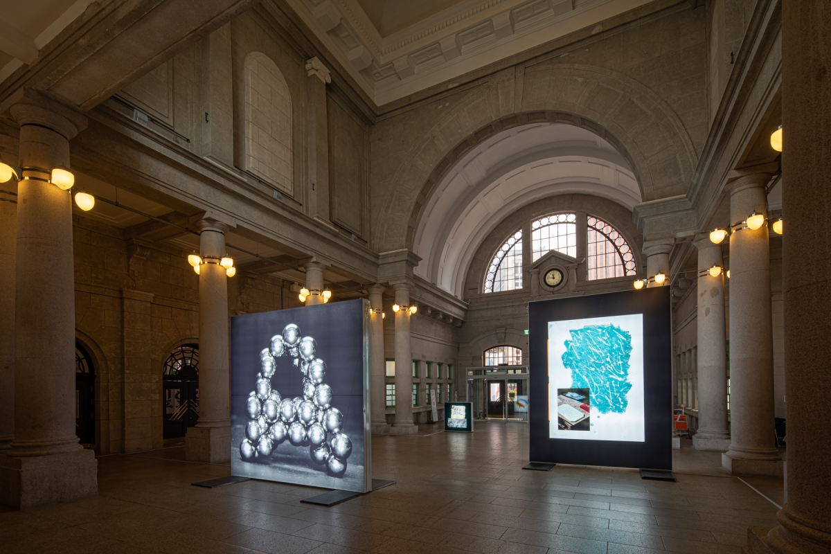
When the sensor detects a frowning face, the computer begins its calculations. It breaks down the structural changes in the facial muscles into dots, lines, and surfaces, and then displays the results as a bar graph on the screen. These emotions become outputs, projected as light and emoticons on the lighting device right next to it as well as in the bottom of the screen. This is a device that reacts to the emotions expressed by an audience, the 'FaceReader' (by Everyday Practice) currently on display in 'Typojanchi 2019'. But how does this work relate to typography?
Hosted by the Ministry of Culture, Sports, and Tourism and organised by the Korea Craft & Design Foundation and the Organising Committee of the International Typography Biennale, the 'Typojanchi 2019' took place at Culture Station Seoul 284. Celebrating its sixth year, the Biennale nominated 'Objects' as its theme this year, following the themes 'City' in 2015 and the 'Mohm (body)' in 2017. It explored the ways that letters connect with objects, from six different viewpoints (kaleidoscopes, polyhedrons, clocks, corners, sundries, plants). Each viewpoint has its own approach and interpretative language. In addition, art director 'Jin Dallae & Park Woohyuk' left the scope of each research object open, saying that '"although objects mean things that are specific and individual, in a broad sense they can be abstract forms or conditions such as maths or music'". Therefore, the exhibition is not orderly, but cluttered in a fashion similar to that of our daily lives, replete with various objects and letters, and all in an interesting way.
Let's look at the subcategories. First, the 'Kaleidoscopes' section focused on the casting of all kinds of forms through the act of combining and placing, like a kaleidoscope that produces different patterns each time. With lighting and mirrors, along with light and shadows, the Three A (by Mina Tabei) in Japanese, Korean, and English forms were given shapes, and the printed material that the artist designed was enlarged with an ultra-macro lens to Actual Size (by Yeju Choi) to examine their physical properties. As with the patterns of the kaleidoscope, the results of the study are more eye-catching in themselves, rather than effective explanations of a given thing.
The 'Polyhedrons' section focused on the 'objectifying' process, in which language becomes characters or objects transformed into letters. In layman's terms, it covered the process and its results in which the message that we want to deliver is brought into shapes (gesture, language), in a way they are seen and heard. That is why some of the works displayed resemble letters: like Korean consonant becomes glass furniture C-14 (by Studio Millionroses), or method of Korean syllable-based writing becomes a three-dimensional object Syllable-based Object-Typeface (by Iran Lim). The previously mentioned 'FaceReader' was also an attempt to render vague facial expressions in characters.
Above this, there was a 'Sundries' section that seems like a collection of all kinds of typography-related goods, a 'Clocks' section that covered the concept of time, and a 'Plants' section that used Variable Fonts (a technology that adjusts the weight, width, and slant of fonts in real-time). The exhibition will be on show until Nov. 3.

43


