Interview Han Seungjae, Kim Sejoong, Han Joowon × Kim Yeram
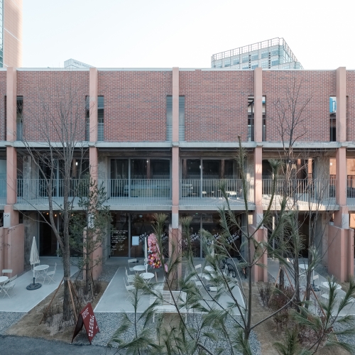
Kim Yeram: JTBC has opened a space in which its young viewers can experience media contents and brand identity. Could you tell us about the moment you took over this complex cultural space project and the reasons why the client chose this space in front of Hongdae?
Kim Sejoong: The client wanted to create a complex cultural space in front of Hongdae, where those from the younger generation are particularly active. You can see an unobstructed view of the exterior landscape from here, which is said to be a big reason behind why the client opted for this building.
Han Joowon: We worked with Han Seungjae on Seongsu Yeonbang (covered in SPACE issue 618), in Daechung Park. He was a good partner to us, so we recommended him to JTBC as a co-operator.
Kim Yeram: You have remodelled a typical commercial facility that used to be an ice cream parlour and a cosmetics store. What kind of design strategy did you devise to turn the existing building into a space appropriate for a broadcasting company?
Han Seungjae: JTBC did not buy this building but rented it for five years, so it was necessary to maintain the original functions of the building. Since everything could not be made new, as in a new construction, the direction of the remodelling design was set by maintaining the volume of the building and cleaning up the exterior. Many people think of Sohn Sukhee, a former anchor and the president and CEO of the company, when they draw the image of JTBC. We wanted to make the building neater, just like one in a well-dressed suit. So, we finished the seams between the outer materials by producing a concrete panel of a calmer tone.
Kim Sejoong: While talking with Han Seungjae, I thought that it would be nice if the building offered the impression of a person in a suit and the furniture in it could act like a pretty tie or cute cufflinks. (laugh) As the building was made tidier than before, we had a task ahead of us to make it fit to JTBC. We responded by making more casual furniture in neater spaces using varied colours and logo play used by the client in their brand identity.
Kim Yeram: I heard that the client requested an open studio capable of shooting various kind of broadcasts, such as TV programmes or YouTube content. It seems that the space and furniture flexibly responds to these varied needs and situations. Please tell us how you were able to reflect these demands within the space.
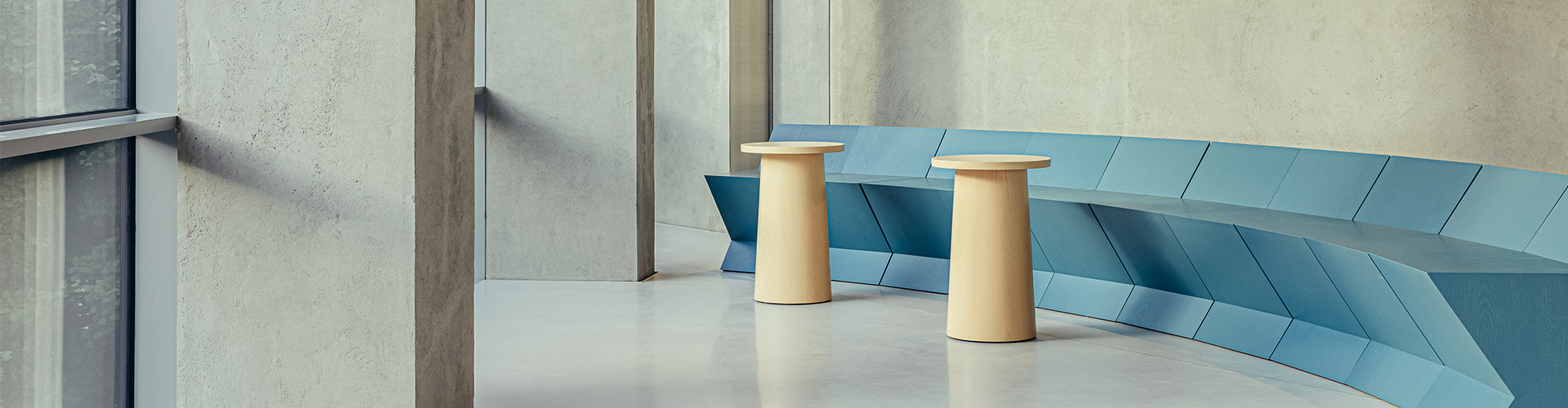
Han Seungjae: The floor plan of the building is shaped like an avocado, angled alongside the site, but, personally, I wouldn’t say I like this form as it doesn’t take functionality into account. In order to create the broadcasting environment that clients want, this plan had to be organised into shape suitable for the new functions. While contemplating the shape of the interior space, an idea struck me: ‘What if we could create an environment for individual creators to broadcast?’ Personal media is the smallest unit in broadcasting content. Unlike traditional broadcast content, which requires multiple cameras and lights, these days you can create a video with only a smartphone. This change to the mode of shooting requires a triangular studio plan that will fit the angle of view, so we built diagonal walls that serve as the background to the videos. The newly inserted walls divide the interior into quarters, allowing them to film multiple scenes on a single floor.
Han Joowon: From the standpoint of making furniture, the wall was an issue throughout the design phase. This wall actually plays a fundamental role in supporting the load, and if it wasn’t there the window would have to be reinforced with X-shaped steel structures. Although it was challenging to attempt this more active furniture placement, one that looks like it penetrates the wall, it eventually allowed us to pursue an interesting shape and arrangement after admitting that the wall was a hindrance to the design of the furniture. As a result, the furniture did not follow the wall but was spaced out like an intriguing feature or concentrated in the centre of the plan.
Kim Yeram: Furniture of different sizes has been stacked on the first floor with products placed upon it. It looks different from the general display method found in a goods store that is able to show a variety of products and product lines at a glance.
Han Joowon: We thought it would attract people to the building by installing furniture that would be aesthetically pleasing. The store sells over 400 items, and it was a challenge to put them all on the one floor. If all of the products were simply listed in the store, it would be like a franchise stationer. So, we received the specifications of all of the items from the client’s brand design team and calculated the required display area. We designed furniture with outstanding form and function based on this calculation, and then persuaded the client that they could display enough products while also developing furniture that would be considered beautiful even with at a brief glance.